Uncaught TypeError: Cannot read property 'foo' of undefined. The dreaded error we all hit at some point in JavaScript development. Could be an empty state from an API that returns differently than you expected. Could be something else. We don’t know because the error itself is so general and broad.
I recently had an issue where certain environment variables weren't being pulled in for one reason or another, causing all sorts of funkiness with that error staring me in the face. Whatever the cause, it can be a disastrous error if it’s left unaccounted for, so how can we prevent it in the first place?
Let’s figure it out.
Utility library
If you are already using a utility library in your project, there is a good chance that it includes a function for preventing this error. _.get in lodash (docs) or R.path in Ramda (docs) allow accessing the object safely.
If you are already using a utility library, this is likely the simplest solution. If you are not using a utility library, read on!
Short-circuiting with &&
One interesting fact about logical operators in JavaScript is that they don't always return a boolean. According to the spec, "the value produced by a && or || operator is not necessarily of type Boolean. The value produced will always be the value of one of the two operand expressions.”
In the case of the && operator, the first expression will be used if it a "falsy" value. Otherwise, the second expression will be used. This means that the expression 0 && 1 will be evaluated as 0 (a falsy value), and the expression 2 && 3 will be evaluated as 3. If multiple && expressions are chained together, they will evaluate to either the first falsy value or the last value. For example, 1 && 2 && 3 && null && 4 will evaluate to null, and 1 && 2 && 3 will evaluate to 3.
How is this useful for safely accessing nested object properties? Logical operators in JavaScript will "short-circuit." In this case of &&, this means that the expression will cease moving forward after it reaches its first falsy value.
const foo = false && destroyAllHumans();
console.log(foo); // false, and humanity is safe
In this example, destroyAllHumans is never called because the && operand stopped all evaluation after false.
This can be used to safely access nested properties.
const meals = {
breakfast: null, // I skipped the most important meal of the day! :(
lunch: {
protein: 'Chicken',
greens: 'Spinach',
},
dinner: {
protein: 'Soy',
greens: 'Kale',
},
};
const breakfastProtein = meals.breakfast && meals.breakfast.protein; // null
const lunchProtein = meals.lunch && meals.lunch.protein; // 'Chicken'
Aside from its simplicity, one of the main advantages of this approach is its brevity when dealing with small chains. However, when accessing deeper objects, this can be quite verbose.
const favorites = {
video: {
movies: ['Casablanca', 'Citizen Kane', 'Gone With The Wind'],
shows: ['The Simpsons', 'Arrested Development'],
vlogs: null,
},
audio: {
podcasts: ['Shop Talk Show', 'CodePen Radio'],
audiobooks: null,
},
reading: null, // Just kidding -- I love to read
};
const favoriteMovie = favorites.video && favorites.video.movies && favorites.video.movies[0];
// Casablanca
const favoriteVlog = favorites.video && favorites.video.vlogs && favorites.video.vlogs[0];
// null
The more deeply nested an object is, the more unwieldy it gets.
The “Maybe Monad”
Oliver Steele came up with this method and goes through it in much more detail in his blog post, "Monads on the Cheap I: The Maybe Monad." I will attempt to give a brief explanation here.
const favoriteBook = ((favorites.reading||{}).books||[])[0]; // undefined
const favoriteAudiobook = ((favorites.audio||{}).audiobooks||[])[0]; // undefined
const favoritePodcast = ((favorites.audio||{}).podcasts||[])[0]; // 'Shop Talk Show'
Similar to the short-circuit example above, this method works by checking if a value is falsy. If it is, it will attempt to access the next property on an empty object. In the example above, favorites.reading is null, so the books property is being accessed from an empty object. This will result in an undefined, so the 0 will likewise be accessed from an empty array.
The advantage of this method over the && method is that it avoids repetition of property names. On deeper objects, this can be quite a significant advantage. The primary disadvantage would be readability — it is not a common pattern, and may take a reader a moment to parse out how it is working.
try/catch
try...catch statements in JavaScript allow another method for safely accessing properties.
try {
console.log(favorites.reading.magazines[0]);
} catch (error) {
console.log("No magazines have been favorited.");
}
Unfortunately, in JavaScript, try...catch statements are not expressions. They do not evaluate to a value as they do in some languages. This prevents a concise try statement as a way of setting a variable.
One option is to use a let variable that is defined in the block above the try...catch.
let favoriteMagazine;
try {
favoriteMagazine = favorites.reading.magazines[0];
} catch (error) {
favoriteMagazine = null; /* any default can be used */
};
Although it’s verbose, this works for setting a single variable (that is, if the mutable variable doesn't scare you off). However, issues can arise if they’re done in bulk.
let favoriteMagazine, favoriteMovie, favoriteShow;
try {
favoriteMovie = favorites.video.movies[0];
favoriteShow = favorites.video.shows[0];
favoriteMagazine = favorites.reading.magazines[0];
} catch (error) {
favoriteMagazine = null;
favoriteMovie = null;
favoriteShow = null;
};
console.log(favoriteMovie); // null
console.log(favoriteShow); // null
console.log(favoriteMagazine); // null
If any of the attempts to access the property fails, this will cause all of them to fall back into their defaults.
An alternative is to wrap the try...catch in a reusable utility function.
const tryFn = (fn, fallback = null) => {
try {
return fn();
} catch (error) {
return fallback;
}
}
const favoriteBook = tryFn(() => favorites.reading.book[0]); // null
const favoriteMovie = tryFn(() => favorites.video.movies[0]); // "Casablanca"
By wrapping the access to the object in a function, you can delay the "unsafe" code and pass it into a try...catch.
A major advantage of this method is how natural it is to access the property. As long as properties are wrapped in a function, they are safely accessed. A default value can also be specified in the case of a non-existent path.
Merge with a default object
By merging an object with a similarly shaped object of "defaults," we can ensure that the path that we are trying to access is safe.
const defaults = {
position: "static",
background: "transparent",
border: "none",
};
const settings = {
border: "1px solid blue",
};
const merged = { ...defaults, ...settings };
console.log(merged);
/*
{
position: "static",
background: "transparent",
border: "1px solid blue"
}
*/
Careful, though, because the entire nested object can be overwritten rather than a single property.
const defaults = {
font: {
family: "Helvetica",
size: "12px",
style: "normal",
},
color: "black",
};
const settings = {
font: {
size: "16px",
}
};
const merged = {
...defaults,
...settings,
};
console.log(merged.font.size); // "16px"
console.log(merged.font.style); // undefined
Oh no! To fix this, we'll need to similarly copy each of the nested objects.
const merged = {
...defaults,
...settings,
font: {
...defaults.font,
...settings.font,
},
};
console.log(merged.font.size); // "16px"
console.log(merged.font.style); // "normal"
Much better!
This pattern is common with plugins or components that accept a large settings object with included defaults.
A bonus about this approach is that, by writing a default object, we’re including documentation on how an object should look. Unfortunately, depending on the size and shape of the data, the "merging" can be littered with copying each nested object.
The future: optional chaining
There is currently a TC39 proposal for a feature called "optional chaining." This new operator would look like this:
console.log(favorites?.video?.shows[0]); // 'The Simpsons'
console.log(favorites?.audio?.audiobooks[0]); // undefined
The ?. operator works by short-circuiting: if the left-hand side of the ?. operator evaluates to null or undefined, the entire expression will evaluate to undefined and the right-hand side will remain unevaluated.
To have a custom default, we can use the || operator in the case of an undefined.
console.log(favorites?.audio?.audiobooks[0] || "The Hobbit");
Which method should you use?
The answer, as you might have guessed, is that age-old answer… "it depends." If the optional chaining operator has been added to the language and has the necessary browser support, it is likely the best option. If you are not from the future, however, there are more considerations to take into account. Are you using a utility library? How deeply nested is your object? Do you need to specify defaults? Different cases may warrant a different approach.
The post Avoiding those dang cannot read property of undefined errors appeared first on CSS-Tricks.
from CSS-Tricks https://css-tricks.com/%e2%80%8b%e2%80%8bavoiding-those-dang-cannot-read-property-of-undefined-errors/
Avoiding those dang cannot read property of undefined errors Find more on: Instant Web Site Tools
source https://www.instant-web-site-tools.com/2019/02/13/%e2%80%8b%e2%80%8bavoiding-those-dang-cannot-read-property-of-undefined-errors/

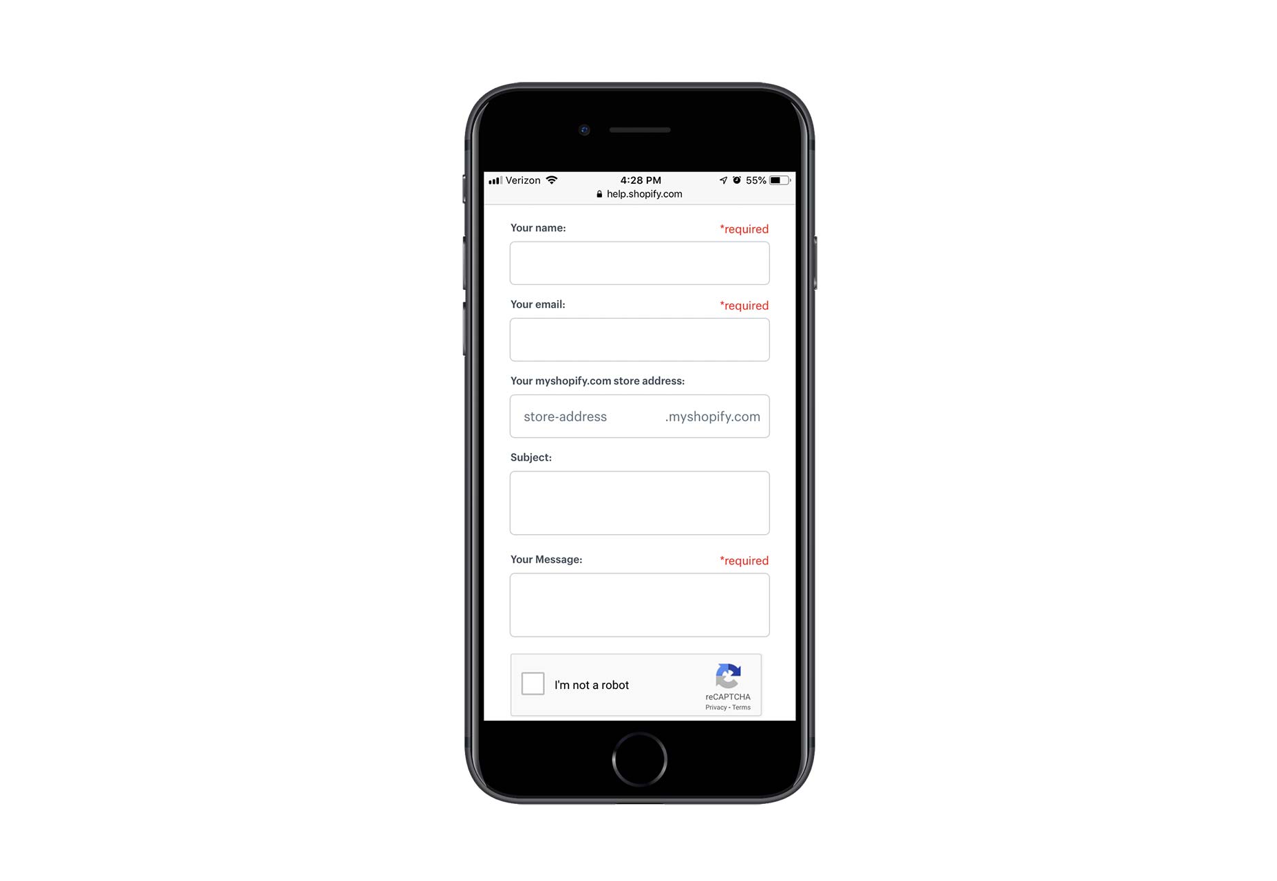
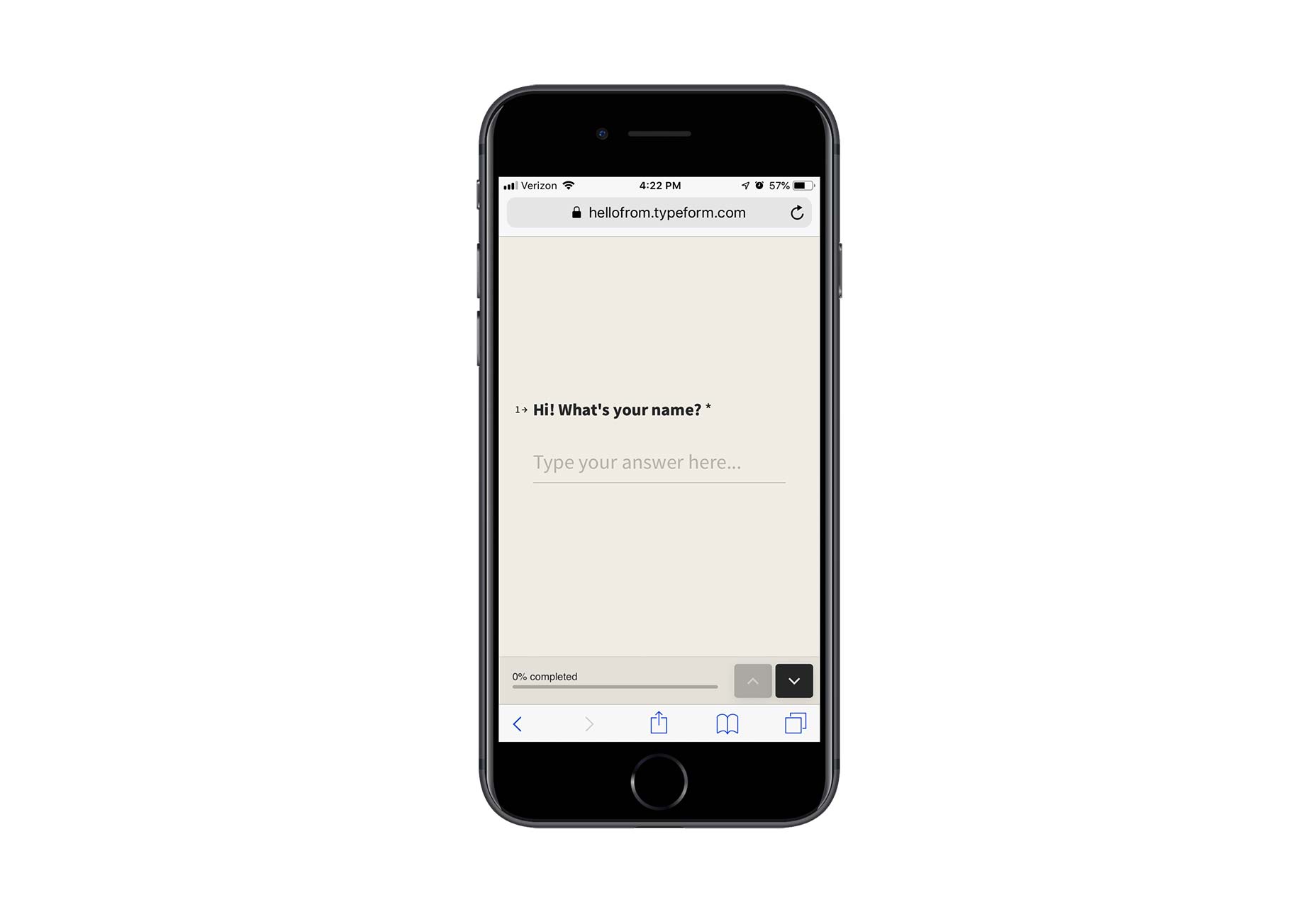
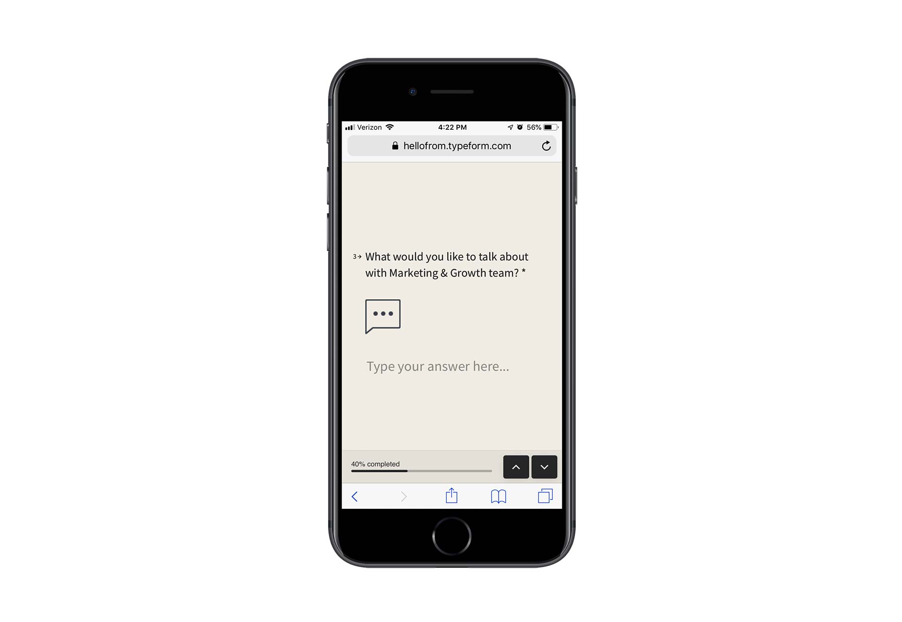
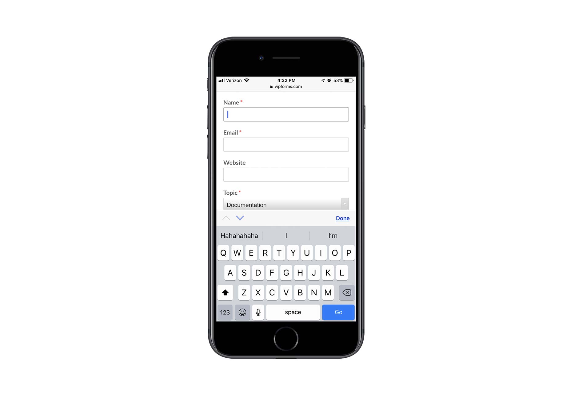
 Contact forms are a necessity for websites. Without them, your clients would be relegated to handling website- or business-related matters over the phone or email. Worse, they’d have absolutely no context for the call or message, which would increase the amount of time they’d have to spend responding to it.