Wednesday, July 31, 2019

Fetching Data in React using React Async

You’re probably used to fetching data in React using axios or fetch. The usual method of handling data fetching is to:

  • Make the API call.
  • Update state using the response if all goes as planned.
  • Or, in cases where errors are encountered, an error message is displayed to the user.

There will always be delays when handling requests over the network. That’s just part of the deal when it comes to making a request and waiting for a response. That’s why we often make use of a loading spinner to show the user that the expected response is loading.

See the Pen
ojRMaN
by Geoff Graham (@geoffgraham)
on CodePen.

All these can be done using a library called React Async.

React Async is a promised-based library that makes it possible for you to fetch data in your React application. Let’s look at various examples using components, hooks and helpers to see how we can implement loading states when making requests.

For this tutorial, we will be making use of Create React App. You can create a project by running:

npx create-react-app react-async-demo

When that is done, run the command to install React Async in your project, using yarn or npm:

## yarn
yarn add react-async

## npm
npm install react-async --save

Example 1: Loaders in components

The library allows us to make use of <Async> directly in our JSX. As such, the component example will look like this;

// Let's import React, our styles and React Async
import React from 'react';
import './App.css';
import Async from 'react-async';

// We'll request user data from this API
const loadUsers = () =>
  fetch("https://jsonplaceholder.typicode.com/users")
    .then(res => (res.ok ? res : Promise.reject(res)))
    .then(res => res.json())

// Our component
function App() {
  return (
    <div className="container">
      <Async promiseFn={loadUsers}>
        {({ data, err, isLoading }) => {
          if (isLoading) return "Loading..."
          if (err) return `Something went wrong: ${err.message}`

          if (data)
            return (
              <div>
                <div>
                  <h2>React Async - Random Users</h2>
                </div>
                {data.map(user=> (
                  <div key={user.username} className="row">
                    <div className="col-md-12">
                      <p>{user.name}</p>
                      <p>{user.email}</p>
                    </div>
                  </div>
                ))}
              </div>
            )
        }}
      </Async>
    </div>
  );
}

export default App;

First, we created a function called loadUsers. This will make the API call using the fetch API. And, when it does, it returns a promise which gets resolved. After that, the needed props are made available to the component.

The props are:

  • isLoading: This handles cases where the response has not be received from the server yet.
  • err: For cases when an error is encountered. You can also rename this to error.
  • data: This is the expected data obtained from the server.

As you can see from the example, we return something to be displayed to the user dependent on the prop.

Example 2: Loaders in hooks

If you are a fan of hooks (as you should), there is a hook option available when working with React Async. Here’s how that looks:

// Let's import React, our styles and React Async
import React from 'react';
import './App.css';
import { useAsync } from 'react-async';

// Then we'll fetch user data from this API
const loadUsers = async () =>
  await fetch("https://jsonplaceholder.typicode.com/users")
    .then(res => (res.ok ? res : Promise.reject(res)))
    .then(res => res.json())

// Our component
function App() {
  const { data, error, isLoading } = useAsync({ promiseFn: loadUsers })
  if (isLoading) return "Loading..."
  if (error) return `Something went wrong: ${error.message}`
  if (data)
  
  // The rendered component
  return (
    <div className="container">
      <div>
        <h2>React Async - Random Users</h2>
      </div>
      {data.map(user=> (
        <div key={user.username} className="row">
          <div className="col-md-12">
            <p>{user.name}</p>
            <p>{user.email}</p>
          </div>
        </div>
      ))}
    </div>
  );
}

export default App;

This looks similar to the component example, but in this scenario, we’re making use of useAsync and not the Async component. The response returns a promise which gets resolved, and we also have access to similar props like we did in the last example, with which we can then return to the rendered UI.

Example 3: Loaders in helpers

Helper components come in handy in making our code clear and readable. These helpers can be used when working with an useAsync hook or with an Async component, both of which we just looked at. Here is an example of using the helpers with the Async component.

// Let's import React, our styles and React Async
import React from 'react';
import './App.css';
import Async from 'react-async';

// This is the API we'll use to request user data
const loadUsers = () =>
  fetch("https://jsonplaceholder.typicode.com/users")
    .then(res => (res.ok ? res : Promise.reject(res)))
    .then(res => res.json())

// Our App component
function App() {
  return (
    <div className="container">
      <Async promiseFn={loadUsers}>
          <Async.Loading>Loading...</Async.Loading>
          <Async.Fulfilled>
            {data => {
              return (
                <div>
                  <div>
                    <h2>React Async - Random Users</h2>
                  </div>
                  {data.map(user=> (
                    <div key={user.username} className="row">
                      <div className="col-md-12">
                        <p>{user.name}</p>
                        <p>{user.email}</p>
                      </div>
                    </div>
                  ))}
                </div>
              )
            }}
          </Async.Fulfilled>
          <Async.Rejected>
            {error => `Something went wrong: ${error.message}`}
          </Async.Rejected>
      </Async>
    </div>
  );
}

export default App;

This looks similar to when we were making use of props. With that done, you could break the different section of the app into tiny components.

Conclusion

If you have been growing weary of going the route I mentioned in the opening section of this tutorial, you can start making of React Async in that project you are working on. The source code used in this tutorial can be found in their different branches on GitHub.

The post Fetching Data in React using React Async appeared first on CSS-Tricks.

from CSS-Tricks https://css-tricks.com/fetching-data-in-react-using-react-async/

Fetching Data in React using React Async is available on www.instant-web-site-tools


source https://www.instant-web-site-tools.com/2019/07/31/fetching-data-in-react-using-react-async/

Bringing CSS Grid to WordPress Layouts

A More Accessible Portals Demo

Are Design Pitches Worthwhile?

For most designers – freelance or in-house – generating new business can be a dreaded part of the job. But it necessary to maintain and sustain growth and find new clients. When it comes to finding design work, is there a best way to find jobs? Do you pitch for new business or rely on other methods to find work?

Reasons to Pitch for New Business

There are so many places that freelance designers can pitch for new business, including job boards, and content or design networks, or marketplaces. Some designers may pitch on social media as well.

But is it worth your time to post in these places to generate business?

For some designers, the answer is, “Yes.”

Pitching requires you to think about the type of work and clients you want to take on. This can be a valuable exercise that helps you grow your business strategically and with the type of work you want to do. If you plan to pitch, create specific pitches that respond directly to postings, avoiding generic “I can do any type of design” pitches.

For freelancers with limited time, this can be an ideal situation

Pitching works for designers that want to know exactly where they stand with projects and don’t want to deal with the management of them. Most pitches you submit in response to a job board or marketplace post will detail a specific design need, timeline, and payment for that work. You know everything up front and don’t have to negotiate terms or deal with scope creep. For freelancers with limited time, this can be an ideal situation.

Pitching can help you find an “in” with new clients and turn into long-term work. There are plenty of designers that have found good projects through Behance, Dribbble, and Upwork.

Pitching might be the only way for a new designer to build a strong portfolio. Depending on the stage of your career, this type of work can help generate clients, relationships, and projects that can lead to more work later.

Whether responding to ads and sending pitches is the right choices depends on you and the stage you are at in your career. It’s not for everyone, but for some designers, pitching can be totally worthwhile, and work better than cold calling or trying to generate new business in other ways.

Reasons Not to Pitch

Some designers hate pitching and find that the time spent looking for new business doesn’t generate enough income to support itself. That’s the top reason not to pitch. If you aren’t bringing in work with pitches, it could actually be costing you money. Analyze pitches sent, responses received, and clients you are actually working with. How much time do you spend on pitching versus revenue generated from actual work from pitching?

If the math doesn’t work out to a sustainable hourly rate, pitching might not be the best option for you. It can be a lot of work, without a large return.

Are you charging less or doing work that you’d never put in your portfolio?

When it comes to responding and pitching for projects, there’s almost always a “middle” company or organization that gets a cut of the payment for the job. If you can generate new business own your own, why pay that fee?

Sometimes pitching can feel spammy or doesn’t help you build more business. Are you cutting your worth to respond to a pitch? Are you charging less or doing work that you’d never put in your portfolio? If the answer to either question is yes, then pitching is probably not for you.

Other Ways to Generate New Design Business

Building a reputation as a designer and taking new clients from word-of-mouth recommendations and referrals is the top way most designers seem to want to generate new business.

But you have to have a fairly established client base and good network for this model to be sustainable. For a lot of designers, this often means that seeking outside work starts with responding to pitch requests while building more of a network and portfolio and then moving to other (more profitable) methods of generating new business.

So how do you generate design business?

There’s a funnel for getting design work for freelancers. At the big end of the funnel is work that’s mostly unsolicited and projects are often granted via pitch (such as marketplaces or job boards). These jobs don’t typically include long-term contracts or big fees. At the small end of the funnel is referrals and repeat client work. These jobs come from relationship building, often pay more and result in longer-term business for more experienced designers.

And then there’s everything in the middle:

  • Cold pitches: Soliciting work from clients via cold call, email, or with a pitch letter;
  • Events: Using speaking engagements or conferences to network and make connections that result in design work;
  • Advertising: Using paid advertising, a website, or email/mail to connect with potential clients that might need design services;
  • Social media: Generating business through social media channels by showcasing work or expertise or offering services;
  • Networking and feeders: Connecting with businesses or design agencies that can subcontract overflow work to you.

The reality is that almost every type of connection requires some type of pitch. The colder the pitch (or less connected you are to the potential client) the more work it will probably take to land the job.

Conclusion

So, we are back to the question at hand: Are pitches worthwhile?

Depending on your career stage, the answer is yes. For early career, or new freelance designers, pitching through marketplaces or job boards can help you grow a business on your own or provide just a little extra income from a side hustle.

For designers that are more established and already have a strong network, cold pitching isn’t the go-to option. In the end, most of us have responded to pitches at some point and either loved the simplicity of pitch and respond work or hated the lower income ratio often associated with these jobs.

Personally, pitching was a great way to establish my position in the field. And with years of experience to show now, work comes via referral. So yes, pitches can be worthwhile. They were a building block in my career and I expect many others share a similar experience.


Featured image via DepositPhotos.

Source

from Webdesigner Depot https://www.webdesignerdepot.com/2019/07/are-design-pitches-worthwhile/

Are Design Pitches Worthwhile? is republished from https://www.instant-web-site-tools


source https://www.instant-web-site-tools.com/2019/07/31/are-design-pitches-worthwhile/

Tuesday, July 30, 2019

How to Change Slide Size in PowerPoint

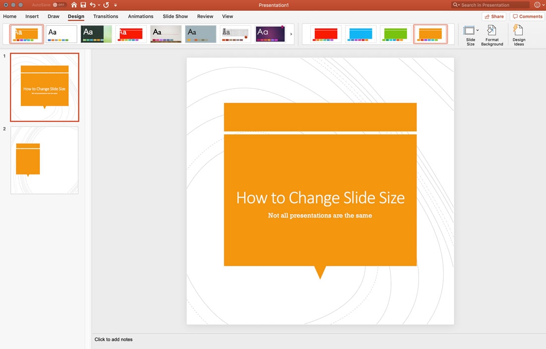
While most users are accustomed to the standard 16:9 aspect ratio of presentations, you can change the size of slides in PowerPoint.

You might change to accommodate a different screen size – maybe the older 4:3 aspect ratio – or to create a custom file type. The tool even includes a few predefined sizes to make it easy for you.

You’ll ideally want the size of your presentation to match whatever device it will be shown on (which is why it’s worth asking about the resolution of the screen or projector you’ll be using in advance!)

Here’s how to change slide size in PowerPoint in a few quick steps.

Change Slide Size Between Standard and Widescreen

The two most common sizes for PowerPoint presentations are standard (4:3) and widescreen (16:9) sizes. The standard size has shifted to 16:9 as more computer and projection screens have moved to this size.

Both are presets that exist within the tool.

how to change slide size powerpoint

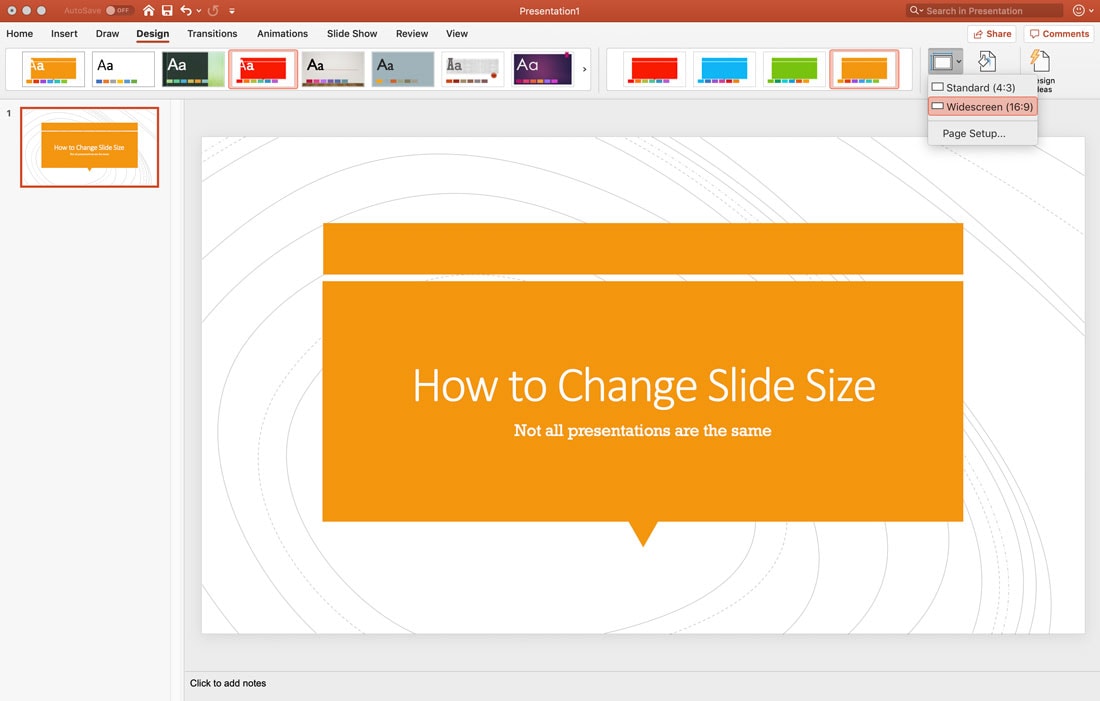
Open your presentation, click Design in the top menu. Find the Slide Size button and click to see the two sizes. Click the one you want to use.

how to change slide size powerpoint

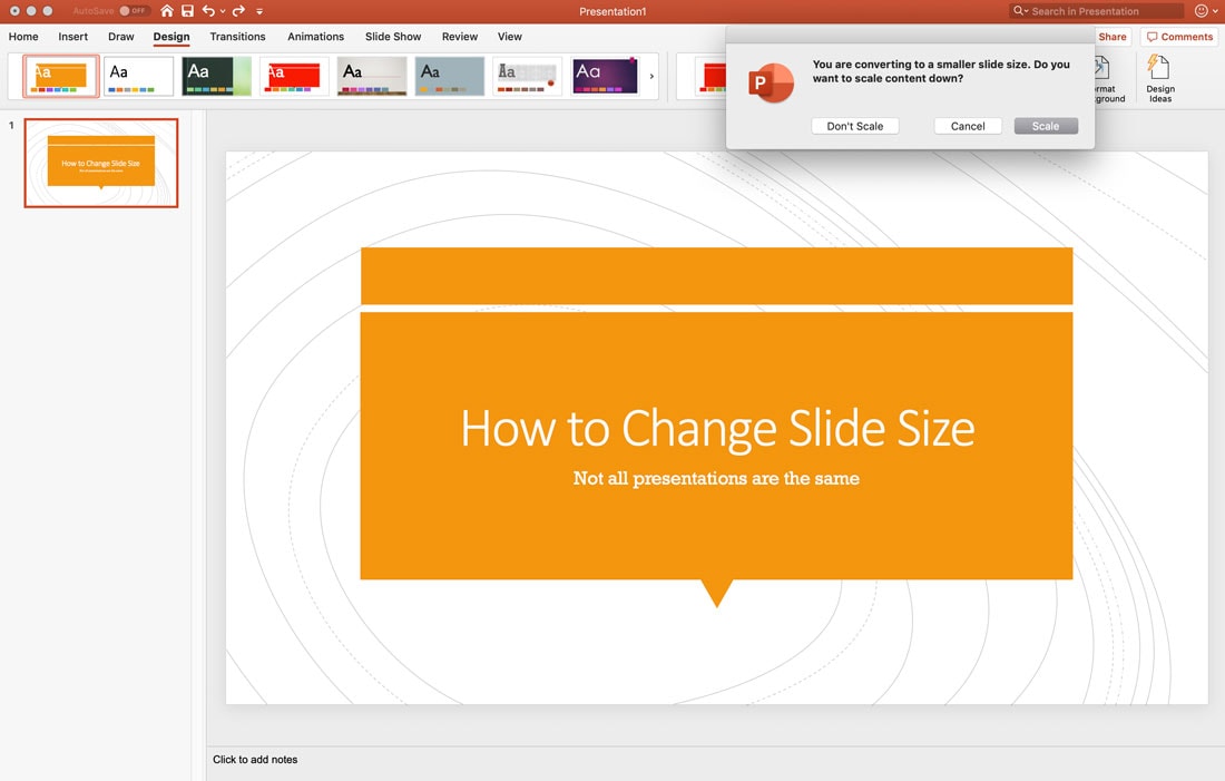
PowerPoint will give you the option to scale content to the new size.

how to change slide size powerpoint

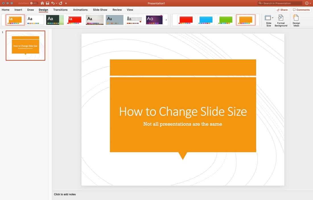
Note that when you change slide size, it affects all of the slides in the open file. If you scale, that also impacts every slide. Make sure to go through and make sure the design of each still looks as intended before giving the presentation. Some adjustments may be necessary.

Change to Another Standard Size

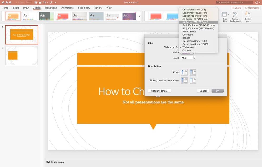
You can also change the size of PowerPoint slides to match other common sizes, such as A4, banner, or ledger using page setup features.

how to change slide size powerpoint

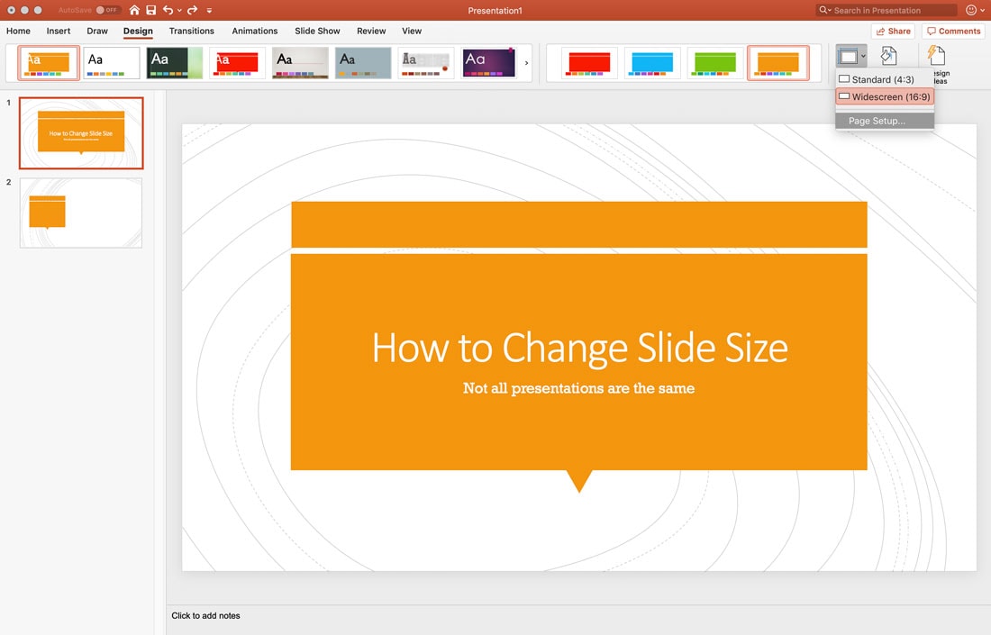
Open the presentation, click Design in the top menu. Find the Slide Size button and click Page Setup. The current configuration is noted with a check mark.

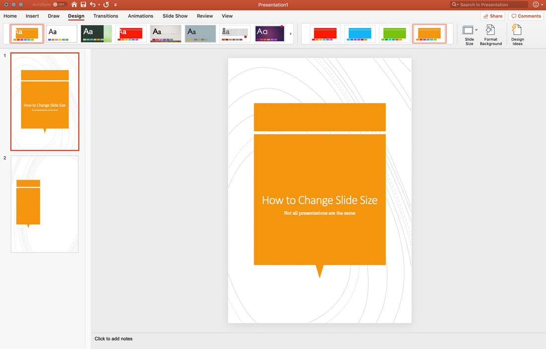
how to change slide size powerpoint

Pick the size and orientation you want to use from the menu and click OK. You will be prompted to choose whether you want to scale the content up or down here as well.

how to change slide size powerpoint

Change to a Custom Slide Size

You can also use a custom slide size in PowerPoint, making each slide any size you want.

how to change slide size powerpoint

Open the presentation, click Design in the top menu. Find the Slide Size button and click Page Setup. The current configuration is noted with a check mark.

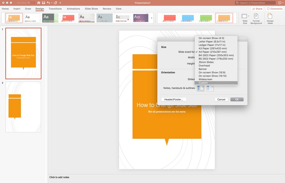
how to change slide size powerpoint

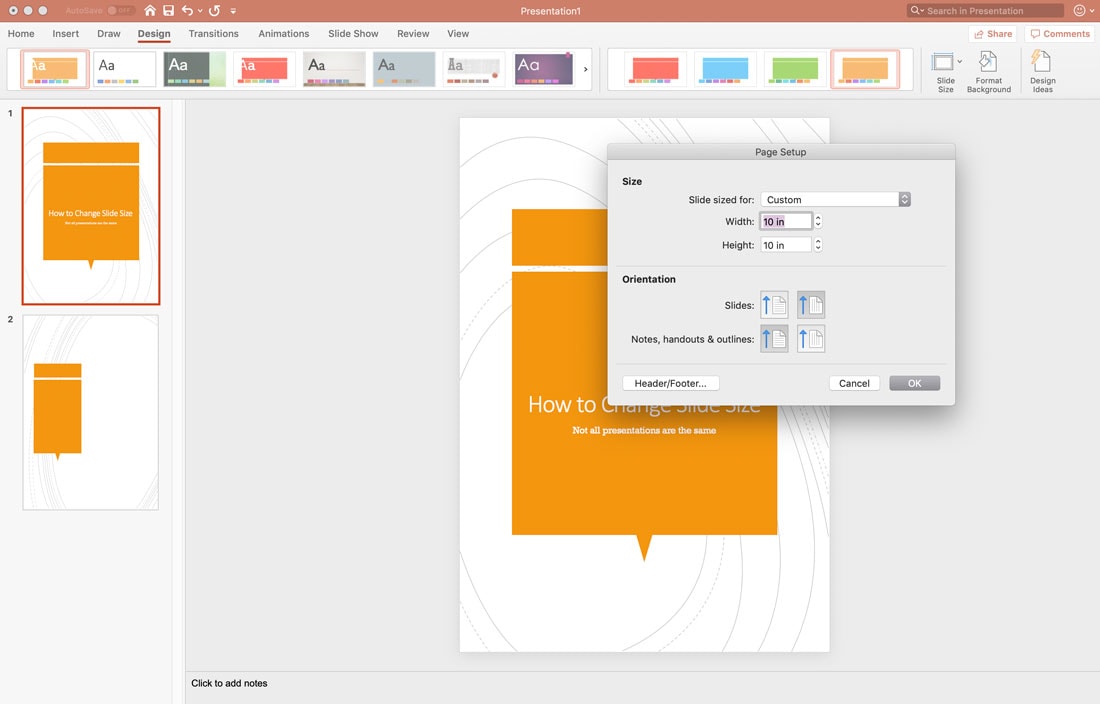
Click custom. Type the desired width and height in the boxes and click OK. You will be asked if you want to scale the content.

how to change slide size powerpoint

Conclusion

When it comes to custom sized slides in PowerPoint, note that not all templates will act the same way when changing size or scaling up or down. Fonts, design elements, and images can sometimes get out of alignment or not quite look the way you want.

While the scale feature is quite helpful, it is important to always go back and check each slide if you change the size after content has already been added to the presentation.

Don’t forget to take a look at our full PowerPoint templates guide, or our collection of the best PowerPoint templates for your next project!

from Design Shack https://designshack.net/articles/software/how-to-change-slide-size-in-powerpoint/

The following post How to Change Slide Size in PowerPoint is republished from Instant Web Site Tools


source https://www.instant-web-site-tools.com/2019/07/31/how-to-change-slide-size-in-powerpoint/

How much specificity do @rules have, like @keyframes and @media?

I got this question the other day. My first thought is: weird question! Specificity is about selectors, and at-rules are not selectors, so... irrelevant?

To prove that, we can use the same selector inside and outside of an at-rule and see if it seems to affect specificity.

body {
  background: red;
}
@media (min-width: 1px) {
  body {
    background: black;
  }
}

The background is black. But... is that because the media query increases the specificity? Let's switch them around.

@media (min-width: 1px) {
  body {
    background: black;
  }
}
body {
  background: red;
}

The background is red, so nope. The red background wins here just because it is later in the stylesheet. The media query does not affect specificity.

If it feels like selectors are increasing specificity and overriding other styles with the same selector, it's likely just because it comes later in the stylesheet.

Still, the @keyframes in the original question got me thinking. Keyframes, of course, can influence styles. Not specificity, but it can feel like specificity if the styles end up overridden.

See this tiny example:

@keyframes winner {
  100% { background: green; }
}
body {
  background: red !important;
  animation: winner forwards;
}

You'd think the background would be red, especially with the !important rule there. (By the way, !important doesn't affect specificity; it's a per-rule thing.) It is red in Firefox, but it's green in Chrome. So that's a funky thing to watch out for. (It's been a bug since at least 2014 according to Estelle Weyl.)

The post How much specificity do @rules have, like @keyframes and @media? appeared first on CSS-Tricks.

from CSS-Tricks https://css-tricks.com/how-much-specificity-do-rules-have-like-keyframes-and-media/

The post How much specificity do @rules have, like @keyframes and @media? is republished from The Instant Web Site Tools Blog


source https://www.instant-web-site-tools.com/2019/07/31/how-much-specificity-do-rules-have-like-keyframes-and-media/

Intrinsically Responsive CSS Grid with minmax() and min()

The most famous line of code to have come out of CSS grid so far is:

grid-template-columns: repeat(auto-fill, minmax(10rem, 1fr));

Without any media queries, that will set up a grid container that has a flexible number of columns. The columns will stretch a little, until there is enough room for another one, and then a new column is added, and in reverse.

The only weakness here is that first value in minmax() (the 10rem value above). If the container is narrower than whatever that minimum is, elements in that single column will overflow. Evan Minto shows us the solution with min():

grid-template-columns: repeat(auto-fill, minmax(min(10rem, 100%), 1fr));

The browser support isn't widespread yet, but Evan demonstrates some progressive enhancement techniques to take advantage of now.

Direct Link to ArticlePermalink

The post Intrinsically Responsive CSS Grid with minmax() and min() appeared first on CSS-Tricks.

from CSS-Tricks http://evanminto.com/blog/intrinsically-responsive-css-grid-minmax-min/

The blog post Intrinsically Responsive CSS Grid with minmax() and min() Find more on: https://www.instant-web-site-tools/


source https://www.instant-web-site-tools.com/2019/07/31/intrinsically-responsive-css-grid-with-minmax-and-min/

Creating Dynamic Routes in a Nuxt Application

The Simplest Way to Load CSS Asynchronously

Scott Jehl:

One of the most impactful things we can do to improve page performance and resilience is to load CSS in a way that does not delay page rendering. That’s because by default, browsers will load external CSS synchronously—halting all page rendering while the CSS is downloaded and parsed—both of which incur potential delays.

<link rel="stylesheet" href="/path/to/my.css" media="print" onload="this.media='all'">

Don't just up and do this to all your stylesheets though, otherwise, you'll get a pretty nasty "Flash of Unstyled Content" (FOUC) as the page loads. You need to pair the technique with a way to ship critical CSS. Do that though, and like Scott's opening sentence said, it's quite impactful.

Interesting side story... on our Pen Editor page over at CodePen, we had a FOUC problem:

What makes it weird is that we load our CSS in <link> tags in the <head> completely normally, which should block-rendering and prevent FOUC. But there is some hard-to-reproduce bug at work. Fortunately we found a weird solution, so now we have an empty <script> tag in the <head> that somehow solves it.

Direct Link to ArticlePermalink

The post The Simplest Way to Load CSS Asynchronously appeared first on CSS-Tricks.

from CSS-Tricks https://www.filamentgroup.com/lab/load-css-simpler/

The Simplest Way to Load CSS Asynchronously Find more on: Instant Web Site Tools


source https://www.instant-web-site-tools.com/2019/07/30/the-simplest-way-to-load-css-asynchronously/

Run useEffect Only Once

React has a built-in hook called useEffect. Hooks are used in function components. The Class component comparison to useEffect are the methods componentDidMount, componentDidUpdate, and componentWillUnmount.

useEffect will run when the component renders, which might be more times than you think. I feel like I've had this come up a dozen times in the past few weeks, so it seems worthy of a quick blog post.

import React, { useEffect } from 'react';

function App() {
  useEffect(() => {
    // Run! Like go get some data from an API.
  });

  return (
    <div>
      {/* Do something with data. */}
    </div>
  );
}

In a totally isolated example like that, it's likely the useEffect will run only once. But in a more complex app with props flying around and such, it's certainly not guaranteed. The problem with that is that if you're doing something like fetching data from an API, you might end up double-fetching which is inefficient and unnecessary.

The trick is that useEffect takes a second parameter.

The second param is an array of variables that the component will check to make sure changed before re-rendering. You could put whatever bits of props and state you want in here to check against.

Or, put nothing:

import React, { useEffect } from 'react';

function App() {
  useEffect(() => {
    // Run! Like go get some data from an API.
  }, []);

  return (
    <div>
      {/* Do something with data. */}
    </div>
  );
}

That will ensure the useEffect only runs once.

Note from the docs:

If you use this optimization, make sure the array includes all values from the component scope (such as props and state) that change over time and that are used by the effect. Otherwise, your code will reference stale values from previous renders.

The post Run useEffect Only Once appeared first on CSS-Tricks.

from CSS-Tricks https://css-tricks.com/run-useeffect-only-once/

The following blog article Run useEffect Only Once was originally published on Instant Web Site Tools Blog


source https://www.instant-web-site-tools.com/2019/07/30/run-useeffect-only-once/

How To Set Up Time Synchronization On Ubuntu

You might have set up cron jobs that runs at a specific time to backup important files or perform any system related tasks. Or, you might have configured a log server to rotate the logs...

The post How To Set Up Time Synchronization On Ubuntu appeared first on OSTechNix.

from OSTechNix https://www.ostechnix.com/how-to-set-up-time-synchronization-on-ubuntu/

How To Set Up Time Synchronization On Ubuntu Read more on: Instant Web Site Tools


source https://www.instant-web-site-tools.com/2019/07/30/how-to-set-up-time-synchronization-on-ubuntu/

30+ Best Monogram Fonts

Creating a monogram is a popular design practice for logos, badges, signage, insignias, and signatures (it actually dates back to the early 350BC!). If you’re working on a monogram design, this collection of monogram fonts and typography is a helpful starting point!

Many brands, products, and businesses still use monograms to craft unique logos that stand out from the crowd (like Volkswagen or Coco Chanel). And we’ve handpicked several unique monogram fonts with decorative designs that you can use for your various projects.

Best of all, you can download all of them to try them out! Envato Elements gives you unlimited access to over 500,000 design resources for a single price.

What Is A Monogram Font?

Monogram designs are quite popular among modern brands and startups, especially when it comes to designing badges and logos. A monogram font is a typeface you can use to design such logos and badges with ease. Using a pre-made monogram font allows you to avoid all the heavy work of having to hand-craft the entire alphabet to design your monogram logos or badges.

Monogram fonts are quite unique and have their own styles of personality that helps you create monogram logos, labels, and badges with an identity. Most monogram fonts are also hand-crafted by professional designers as well.

4 Tips for Designing a Monogram

If you’re working on a monogram design, follow these tips to make it look more professional.

1. Choose Your Monogram Style

Monograms have their own different styles and trends. There are monograms with vintage design themes, retro designs, futuristic designs, and more.

It’s up to you to decide which theme you’re going to use for your own projects. First, think about how you’re going to use the monogram. Is it for a luxury brand logo? A logo for a business card? Or a design for a wedding invitation? Choose the style accordingly.

2. Find a Font That Fits Your Brand

Once you pick a style for your monogram, you can follow that same theme to pick an appropriate font for your monogram design. When it comes to monogram fonts, you’ll find many choices with various design styles. However, depending on the type of design you’re making, whether it’s a luxury brand logo or a product label, pick a font that represents your brand qualities and its target audience.

Take the New York Yankees monogram logo, for example. It effectively captures their heritage and their fans with its unique letter design and the choice of color.

3. Use Shapes and Emblems

Using creative shapes to connect the letters as well as using shields and emblems can also add a creative and attractive look to your logo or badge design.

Many popular brands like Volkswagon, LG, and HP use shapes and emblems in its monogram logo designs to make the designs stand out from the crowd.

4. Aim for a Minimal Look

Monogram designs are widely used by luxury and high-end brands like Gucci and Chanel. These designs feature overall minimal designs with fewer colors to truly capture their authority and elegance.

However, there are many bright and colorful monogram designs as well. CNN and ESPN logos are popular examples of more entertaining monogram logos. To capture the true essence of a monogram design, try to use fewer colors and minimal font design.

Top Pick

Carose Sans – 6 Elegant Monogram Fonts

Carose Sans- 6 Elegant Monogram Fonts

Carose Sans is a modern and elegant family of monogram fonts that feature a set of characters with a unique style of designs. This font is perfect for designing monogram logos and badges for luxury brands and high-end products.

The font family includes 6 unique font weights with all-caps letters. It also includes ligatures, glyphs, and accented characters.

Why This Is A Top Pick

Its unique character design with minimalist yet creative monogram look and feel makes this font truly one of a kind. Since it also comes with 6 different weights and with lots of alternates and ligatures you’ll be able to experiment with many styles of designs as well.

Moalang Pro – Monogram Font

Moalang Pro Monogram Font

This beautiful vintage-themed font comes with letters featuring stylish decorations and curvy edges that makes it the perfect choice for designing monogram badges and logos. The font includes multilingual characters and lots of alternates as well.

Faun – Font Duo

Faun - Font Duo

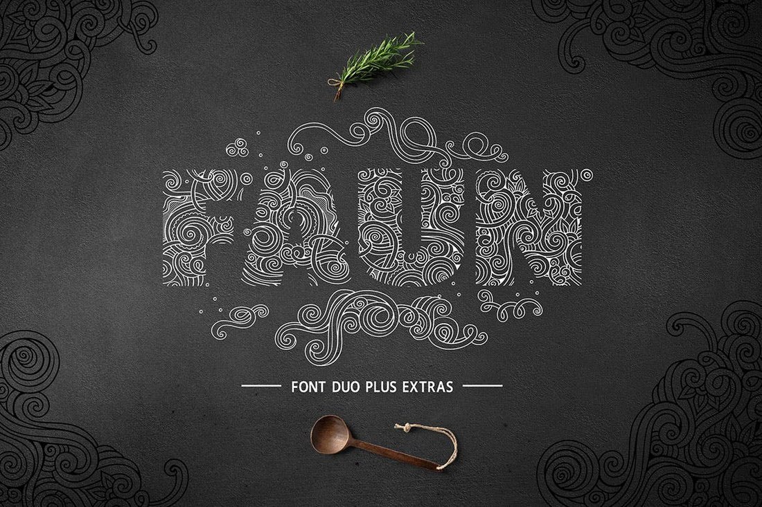
Faun is a font duo made specifically for creating monograms. At first sight, the font will remind you of the creative monogram logo of Unilever. You can create a similar logo or a monogram using this font without having to spend a fortune on a logo design agency.

Sortdecai – Display Font

Sortdecai - Display Font

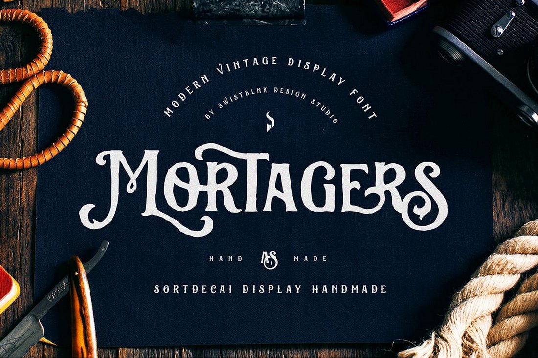
Sortdecai is a family of handcrafted fonts that feature vintage designs. It comes with 370 glyphs along with ligatures, alternates, and lots more. The font also supports OpenType features for InDesign and Illustrator.

Bouchers – Script Font Duo

Bouchers - Script Font Duo

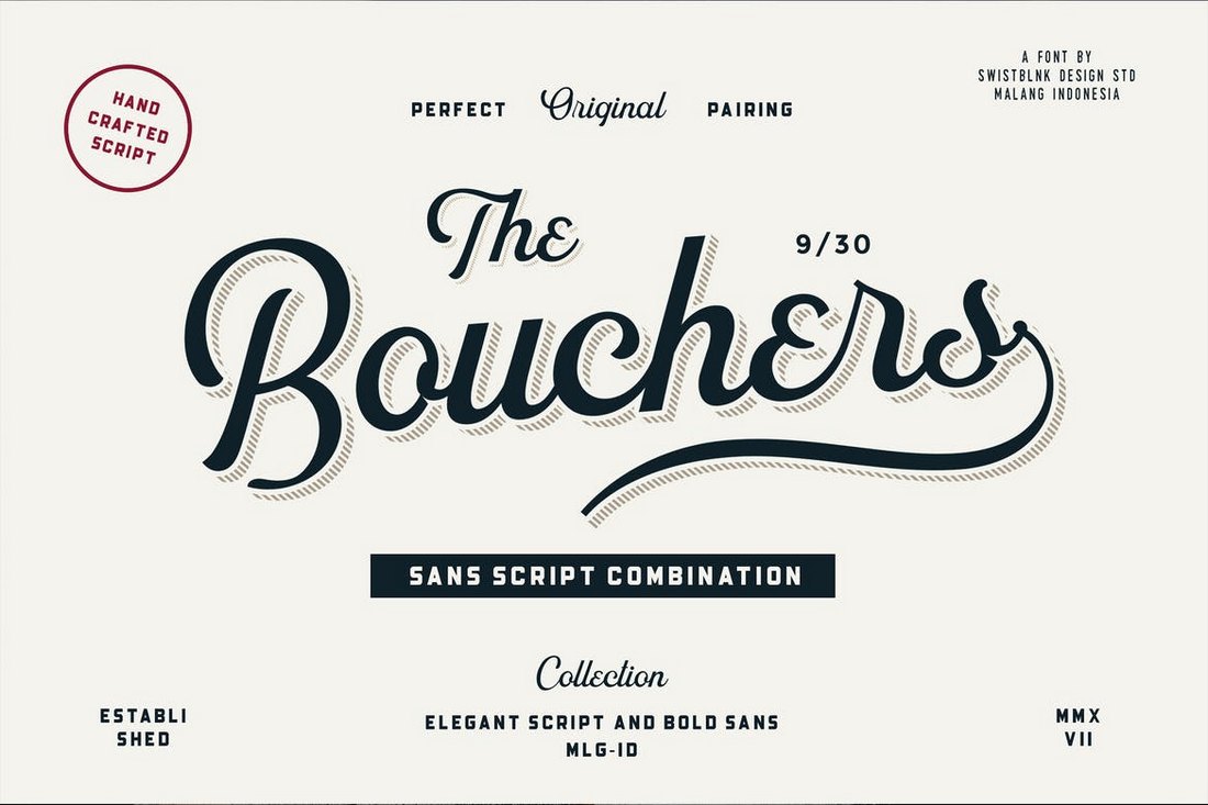
Another stylish font that features both uppercase and lowercase characters with beautiful decorative designs. You can use the font to create modern monograms as well as logo designs.

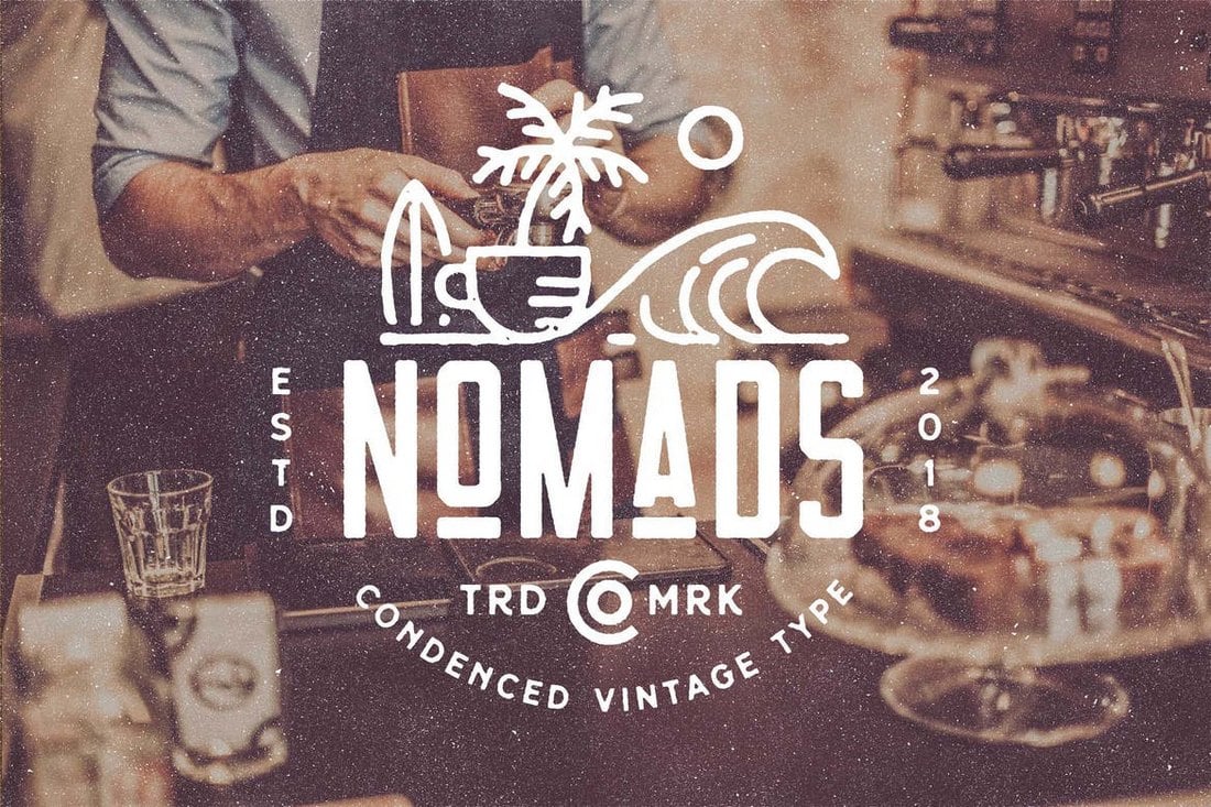
Nomads – The Farmer Original Typeface

Nomads - The Farmer Original Typeface

Nomads font comes with a retro-themed design and decorative elements. It has the ideal look and design making monogram badges. The font is available in Regular, Rounded, and Vintage styles.

Exodus – Free Elegant Monogram Font

Exodus - Free Elegant Monogram Font

This elegant and free monogram font is most suitable for designing modern and luxury monogram logos. The font includes multiple styles of designs and font weights. It’s free to use with your personal projects.

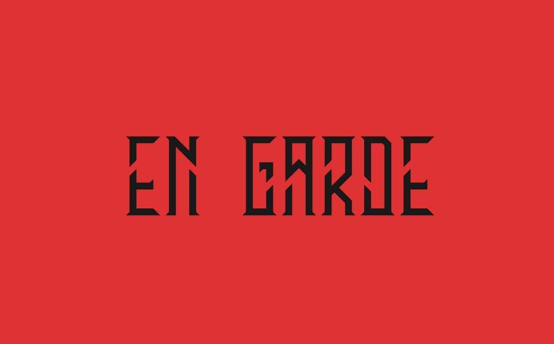
En Garde – Free Modern Condensed Font

En Garde - Free Modern Condensed Font

En Garde is a creative font featuring a stylishly narrow character design. It’s perfect for everything from modern logo designs to labels and badges. The font is free to use with your personal and commercial projects.

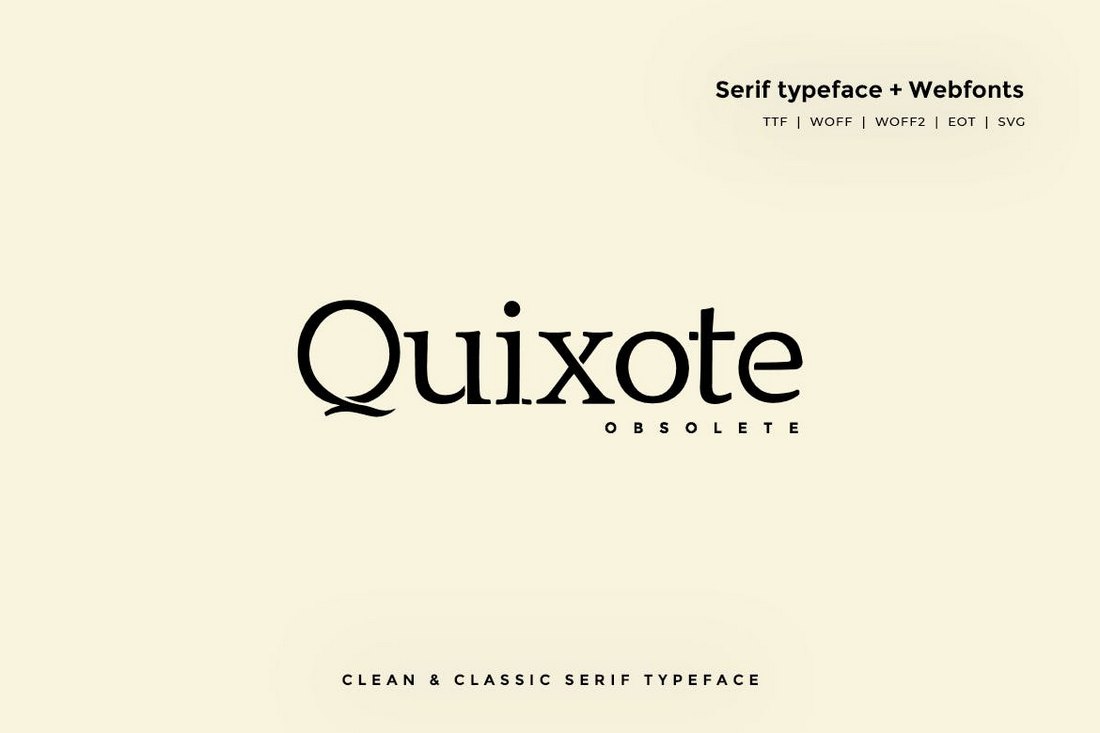
Quixote Obsolete – Classic Typeface

Quixote Obsolete - Classic Typeface

The plain and simple design of this font makes it the best choice for designing monograms for luxury and high-end brands. The clean classic look of the font makes it truly one of a kind.

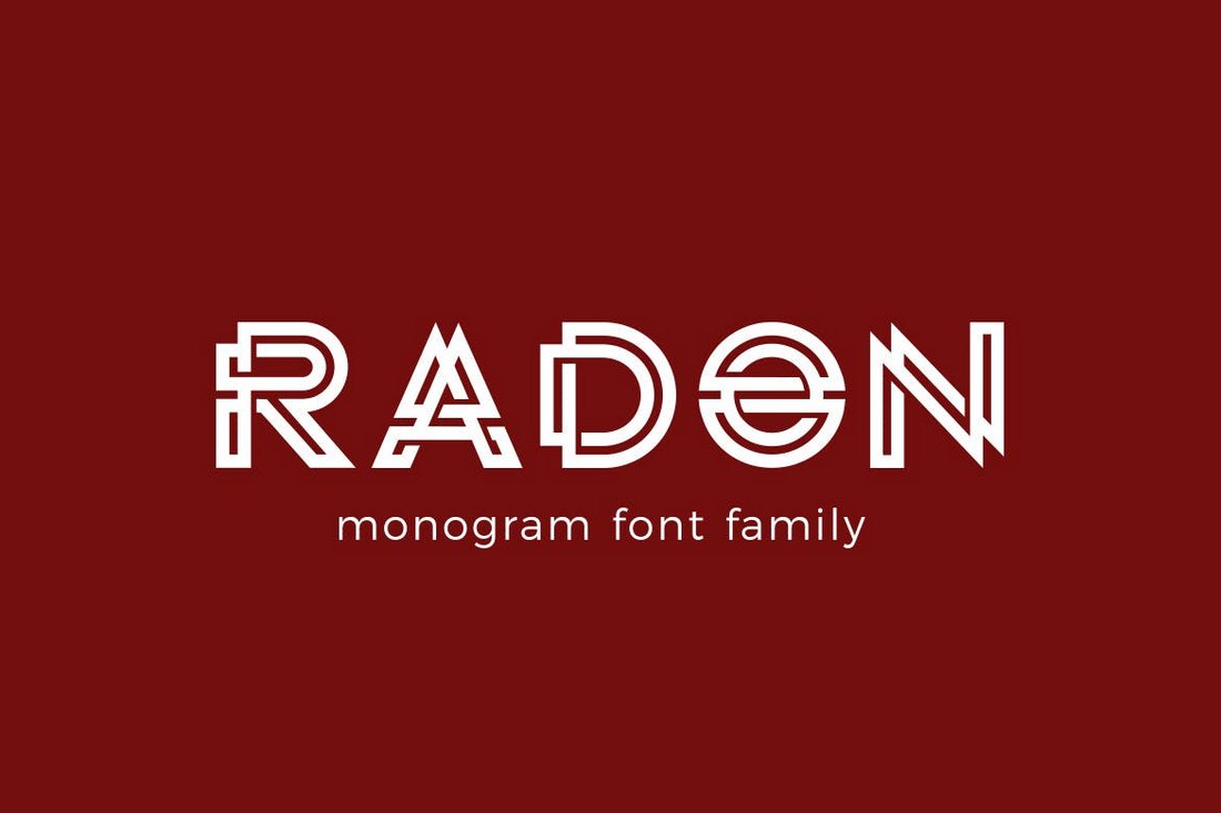
RADON – Monogram Logo Font

RADON - Monogram Logo Font

Radon is a monogram font made specifically for crafting logos. It features a unique character design that will make your designs stand out from the crowd. The font comes in Regular, Bold, and Deco styles.

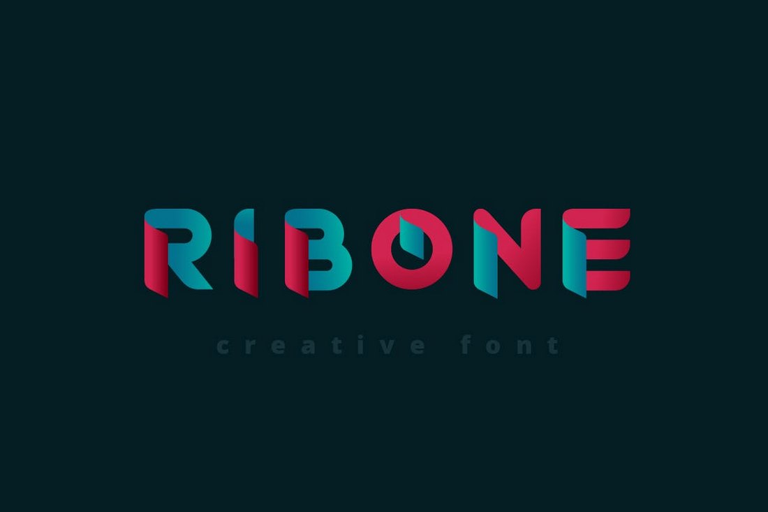
RibOne – Creative Font

RibOne - Creative Font

RibOne is also a font with a creative set of characters. It has a design made for creating monograms for modern brands. The color gradient version of the font is also included in this pack as an EPS file.

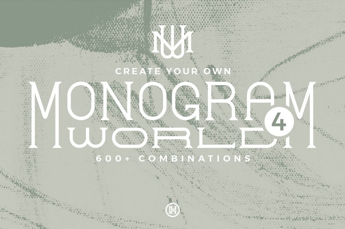
Monogram World – Monogram Bundle

Monogram World - Monogram Bundle

This is a unique bundle of monogram letters that comes in Light and Regular styles. The designer promises that you can use the font to create more than 600 different combinations to create monogram badges. It also comes with 10 premade badges in AI and EPS formats as well.

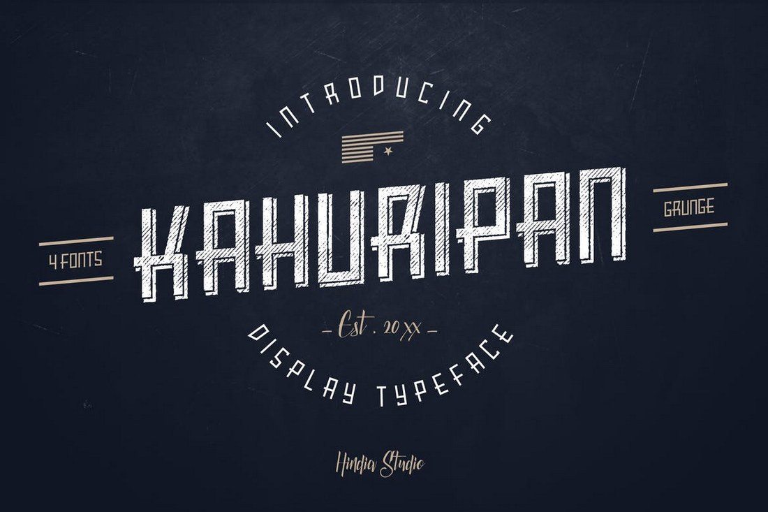
Kahuripan

At first sight, you can see that this is the perfect font for crafting badges, signage, and logos. Kahuripan is a bold display font that can also be used for many types of monogram design work. You can use it to craft many types of designs from labels to product packaging, T-shirt designs, and more.

College Stencil – Free Font Family

College Stencil - Free Font Family

This free font family comes with a set of uncommon characters featuring both uppercase and lowercase letters. You can use the fonts for free with your personal projects.

Stanley – Free Luxury Monogram Typeface

Stanley - Free Luxury Monogram Typeface

Stanley is an elegant monogram font that’s perfect for designing logos and labels for luxury brands and high-end products. This font is free to use with personal and commercial projects.

Rising Star

Rising star is a monoline script font that comes with a modern design. Monoline is a type of font that’s commonly used in logo design. This font, however, features a modern design that makes it suitable for monogram designs such as signage and insignias as well. The font also includes 3 different weights.

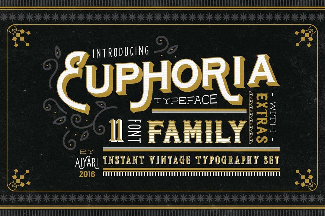
Euphoria Font Family

Euphoria is a family of fonts that features a design inspired by the Victorian-era. It comes in several different styles of the font including a shadow, gradient, serif, outline, tuscan, and more, making a total of 11 fonts. All typefaces include uppercase and lowercase letters, numbers, punctuations, and alternate characters.

Mutiara Vintage

Featuring a mixed design of modern and vintage elements, Mutiara is a bold typeface that goes along with many different types of monogram designs. The font comes with slab, bold, and rough styles along with 54 alternate characters for crafting unique designs.

The Crow

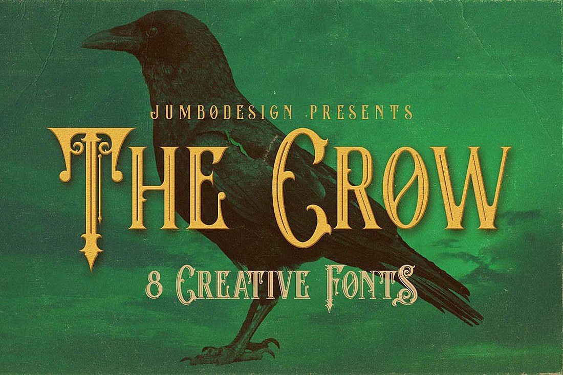
The crow is a unique retro-themed font with a Victorian-era design. The font can be used to craft many different types of monograms as well as logo designs and signage. The crow also features 8 different types of font styles, including grunge, shadow, and inline. You’ll be able to use the fonts with multiple projects.

Argon – Free Creative Monogram Font

Argon - Free Creative Monogram Font

Argon is another creative free monogram font that features a unique character design. The font’s style of character design makes it easy to combine letters for making monogram designs.

Moalang – Free Display Font

Moalang - Free Display Font

Moalang is a free display font with stylish characters that can be also used to design monogram designs. It’s most suitable for making monogram logos and badges.

Morning Glory

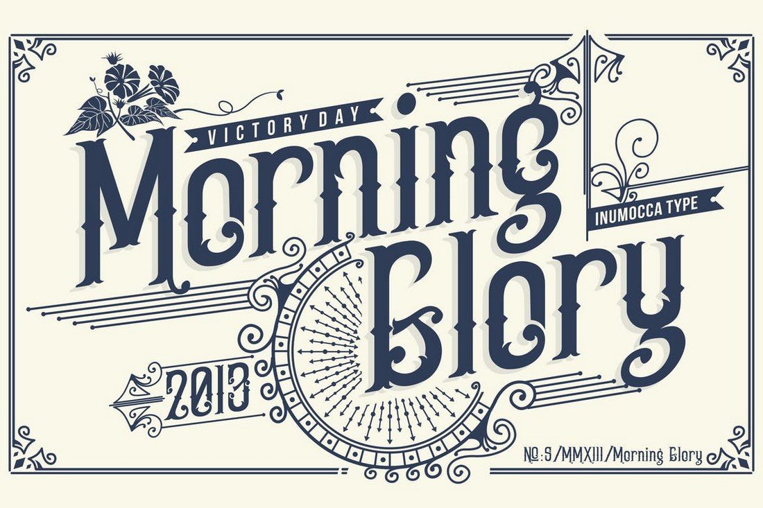
Morning glory is yet another font that’s been designed inspired by Victorian day culture and fashion. It includes both uppercase and lowercase letters, symbols, numbers, and punctuation. The font is ideal for designing insignias, badges, and more.

Mermaid Typeface

This font also features a vintage design with a quirky feel. It’s most suitable for signage, badge, and other types of monogram designs. The font also includes a webfont version, which will come in handy if you’re working on a website or a web app design.

Forest Line

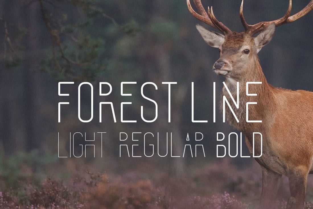
Forrest line is a creative font with a modern design. It’s a multi-purpose font that you can use to design logos, signage, monograms, badges, and much more. The font is available in 3 styles: Light, regular, and bold.

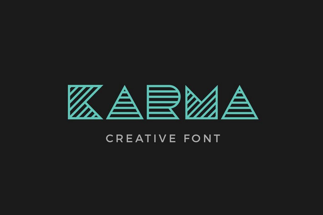
Karma

If you’re looking for a font with a retro-futuristic look, this is the perfect font for you. This font features a modern design with a retro feel, which makes it perfect for a fashion, luxury, and entertainment related brand designs. The font also includes a webfont version as well.

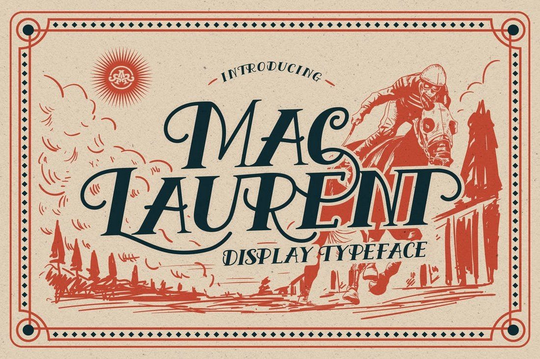
MacLaurent

MaLaurent is a true monogram font that you can use to design classical and luxury brand designs, like crafting monograms for wine bottles and drink glasses. The font can also be used to design greeting cards, logos, and posters as well. The webfont version of the font is also included in the bundle.

Free Two-Letter Vintage Monogram Font

Free Vintage Monogram Font

If you’re making a two-letter monogram logo or a badge with a vintage theme, this free font will come in handy. It comes with 5 font weights and 2 different styles.

Space – Free Futuristic Monogram Font

Space - Free Futuristic Monogram Font

Space is a free display font featuring a set of futuristic characters. Its unique style also makes it easier to combine the letters to create monogram designs.

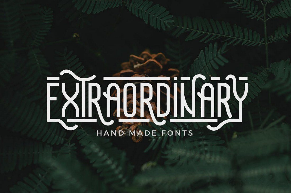
Extraordinary – Handmade Font

This is another modern monogram font with a hand-crafted design. It comes with several creative styles as well as a webfont version for your web-based design work. You can use it to craft monograms, badges, and even website headers as well.

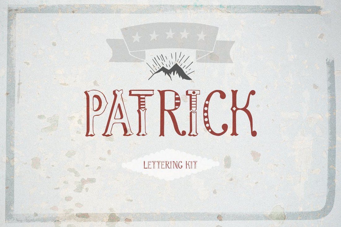
Patrick font & Lettering Kit

This font comes with a unique and a creative design that will certainly make your monograms, badges, and logo designs stand out. The creative and illustrated letters in this font make it truly one of a kind. Additionally, the font includes a vector file full of graphic elements for crafting your own illustrations as well.

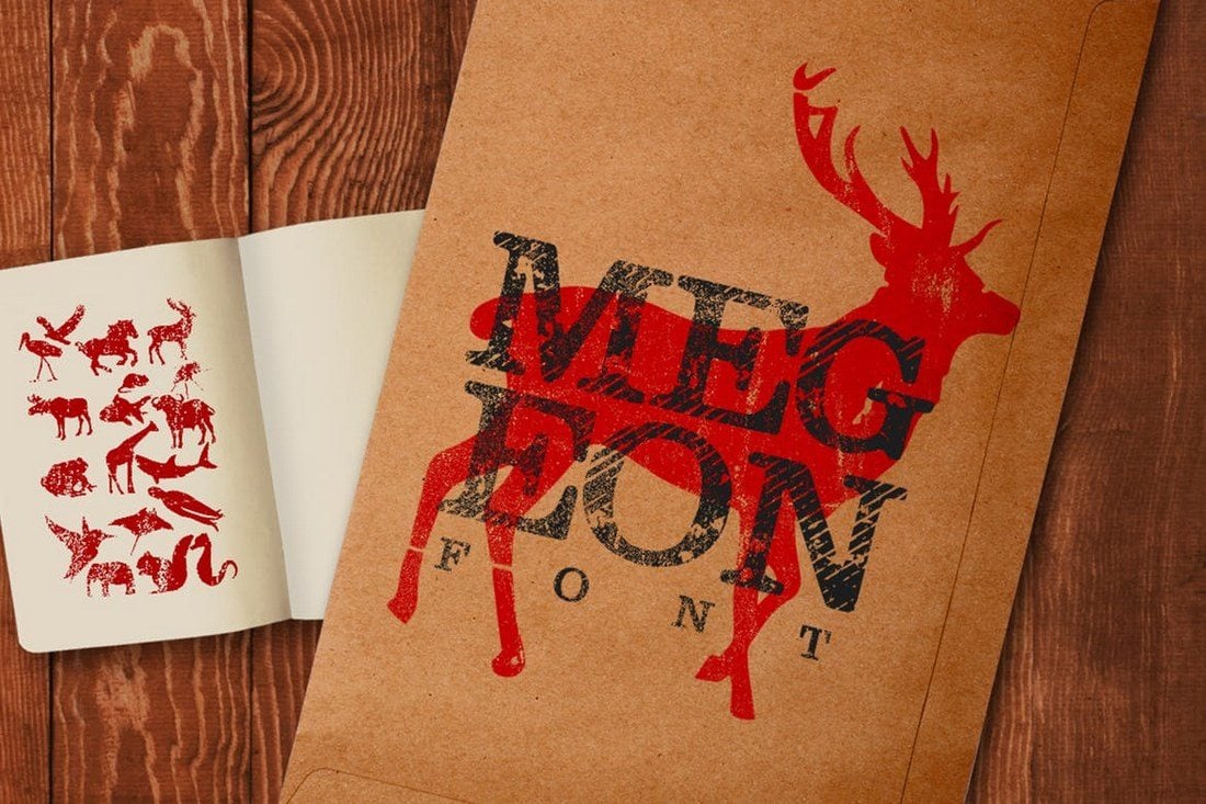
Megeon Font

Megeon is a font made for badges, product labels, and signage. The font features a boldly modern design that makes is suitable for many different types of designs. It also comes in 3 different styles, bold, vintage, and grunge.

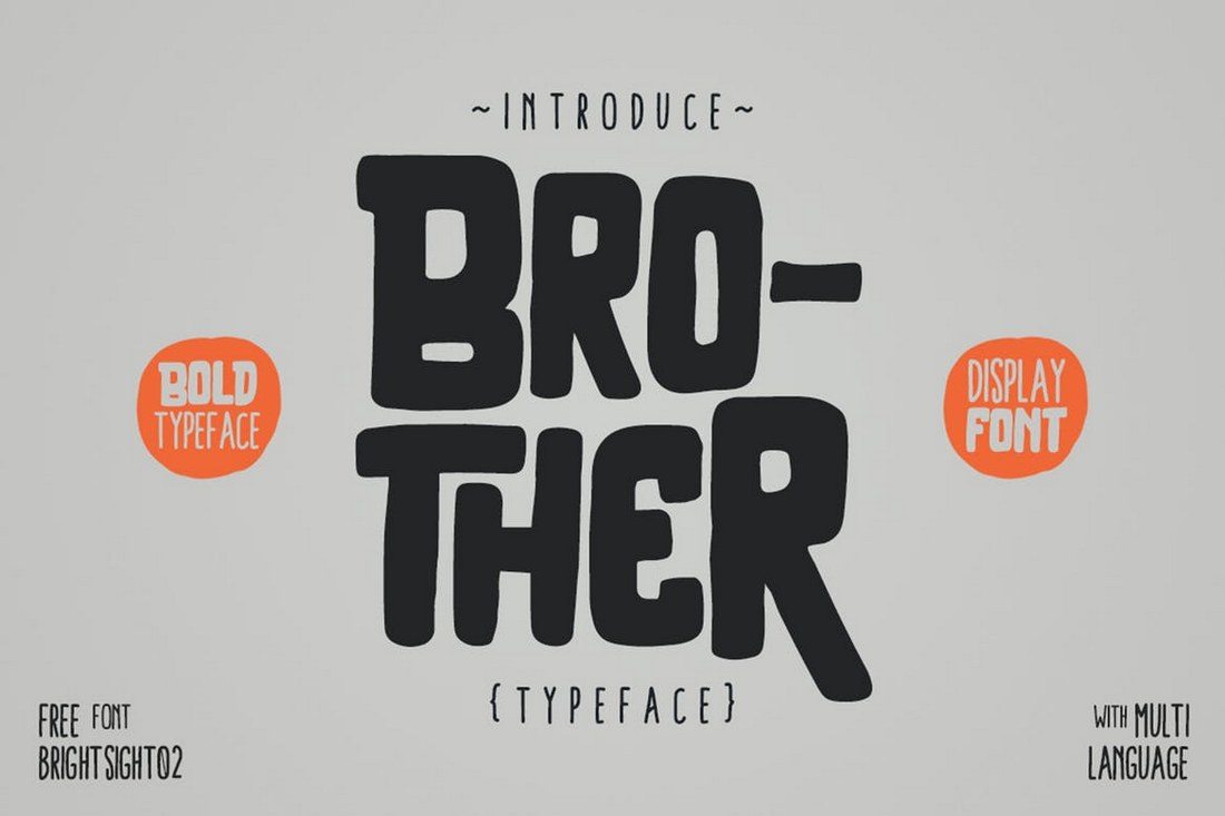
Brother Typeface

The quirky and fun design of this font will allow you to use it with your entertainment and kids-related design projects. Brother is a bold display font that features many characteristics of a monogram font. You can also use it to craft book covers, posters, headers, and more.

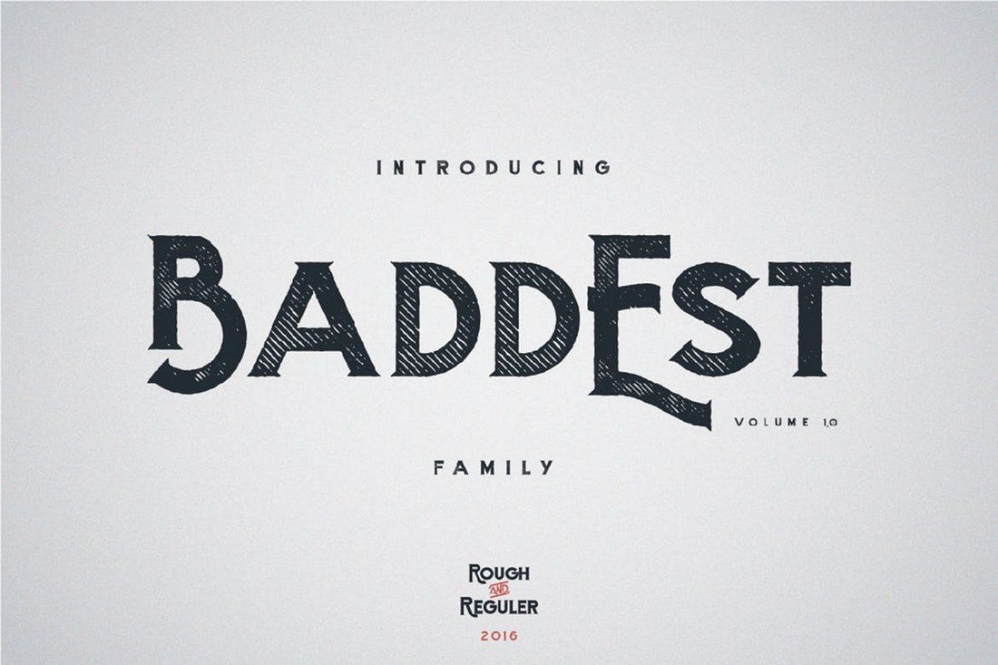
Baddest typeface

Baddest font comes in two styles, bold and rough. Both typefaces feature uppercase and lowercase letters, numbers, and ligatures. The textured design of the font makes it ideal for crafting badges and monograms, as well as posters, logos, and website headers.

Pamu – Free Creative Monogram Font

Pamu - Free Creative Monogram Font

Pamu is a free font you can use with both personal and creative projects. It also features an all-caps character set most suitable for monogram logos.

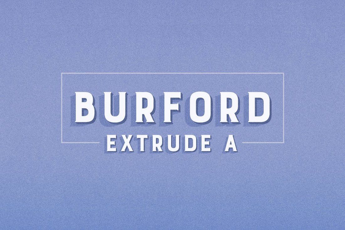
Burford Extrude A

Burford is a bold font that comes with a professional design. It’s perfect for designing many different types of monograms, logos, badges, and more. The font also features many extra features as well.

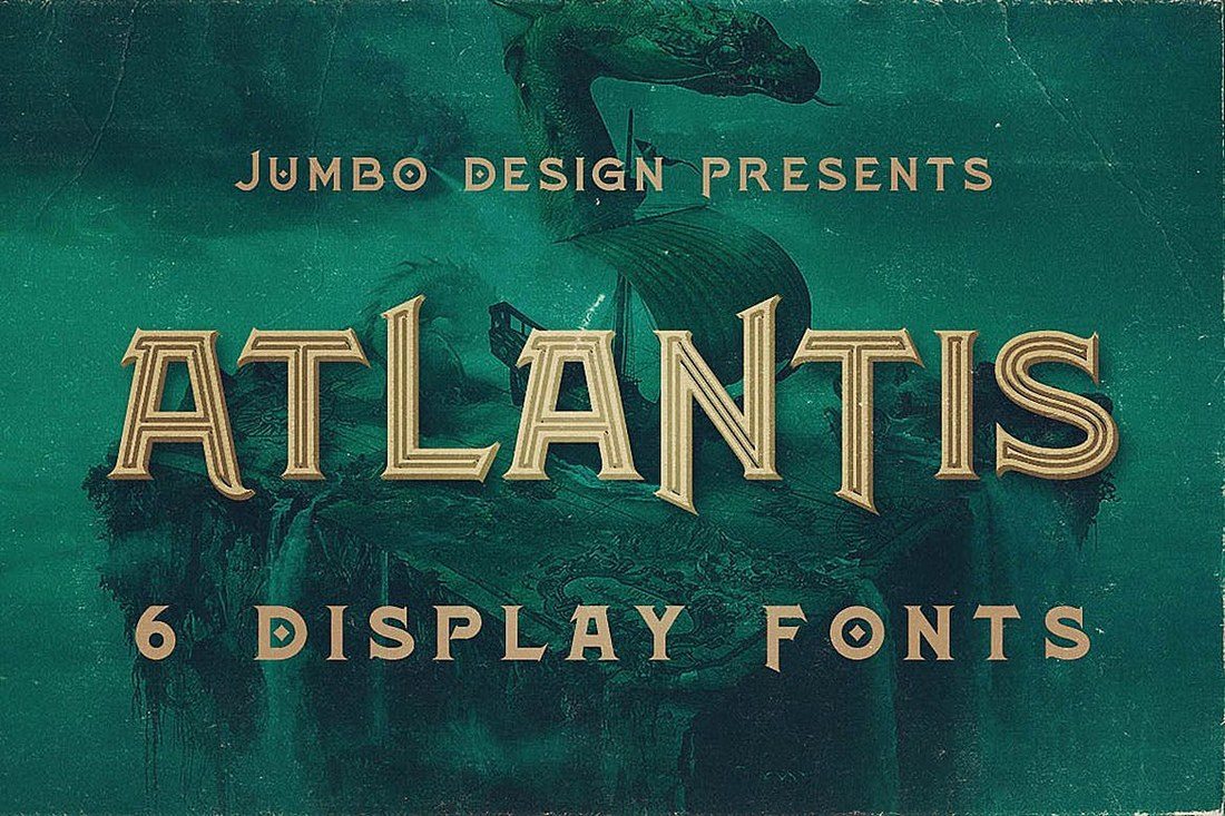
Atlantis

Atlantis is a truly unique font with an attractive design. The font comes in 6 different styles, including inline, grunge, and bold designs. This typeface is ideal for designing all types of monograms, posters, and badges.

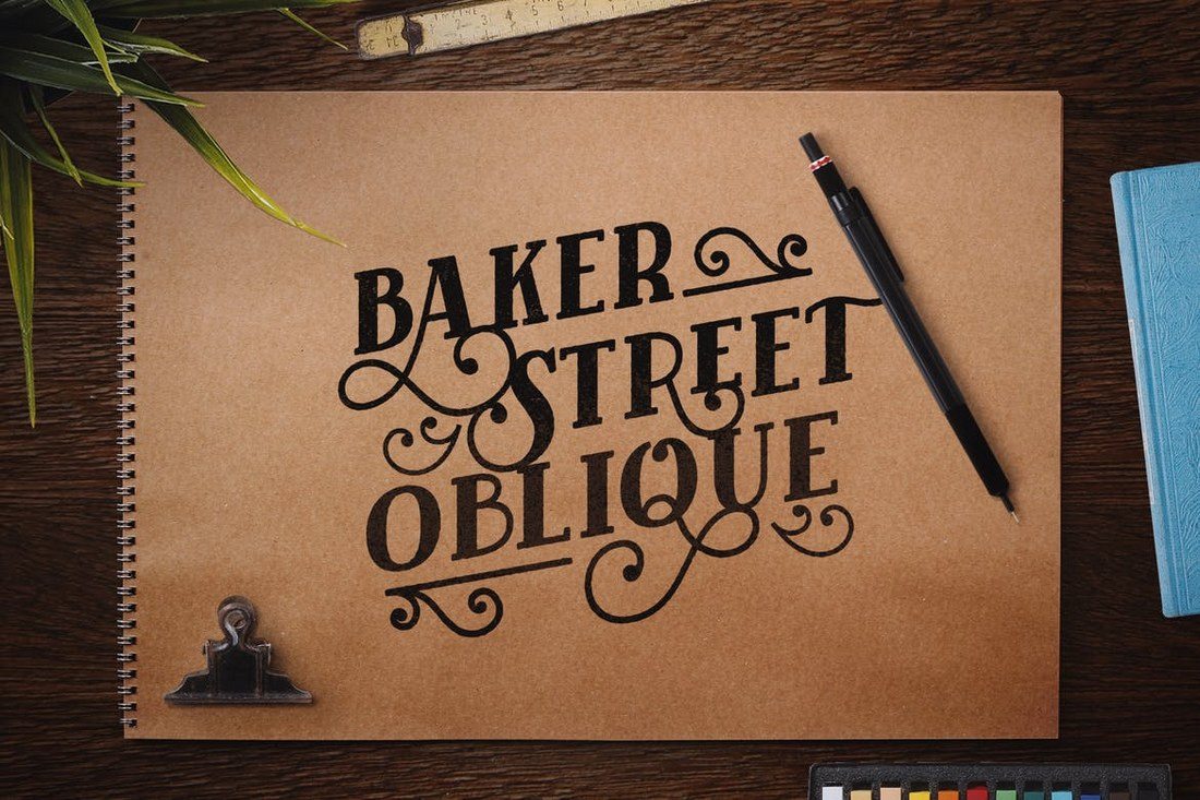
Baker Street Black Oblique

Inspired by the signage and designs from London, Baker Street is a font that will truly take your own designs back in time. The font features swashes and many alternate characters for also making your designs stand out.

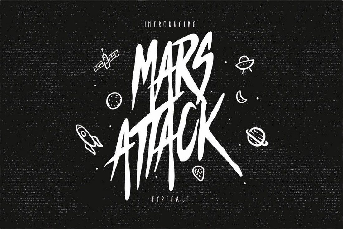
Mars Attack

Mars attack is a creative space-themed font that features a horror-like design, which makes it perfect for crafting everything from monograms to signage, badges, posters, and more.

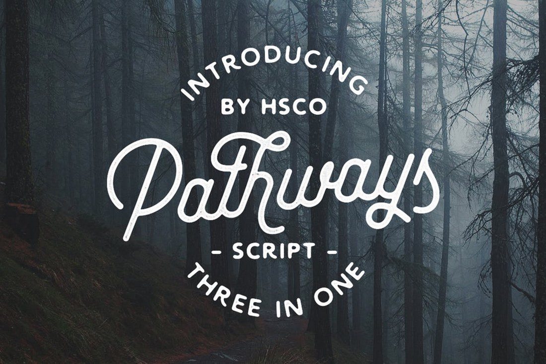
Pathways

This elegantly designed font comes in 4 different styles, including circular strokes, rectangular strokes, and a rough version. The font includes lots of alternate characters and ligatures as well.

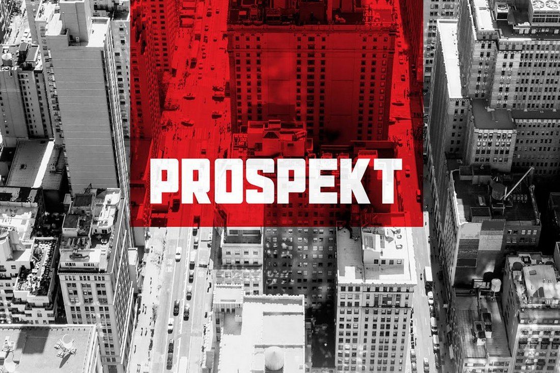
Prospekt Typeface

Prospekt is a font that features a design with perfect symmetry. It’s perfect for designing monograms, logos, and many other types of designs. The font also features 3 different styles, including rocky and press styles.

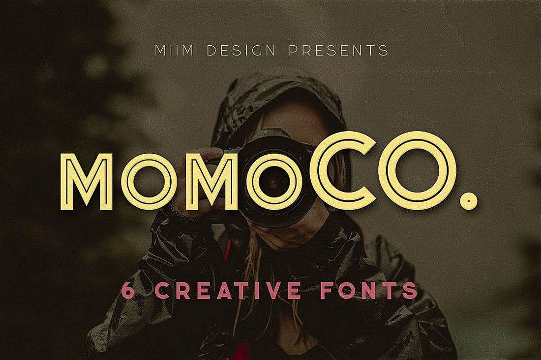
Momoco

This is a family of 6 fonts that features various styles of grunge designs. The font comes with a unique decorative layout that also makes it most suitable for logo and monogram designs, especially for fashion and luxury brands.

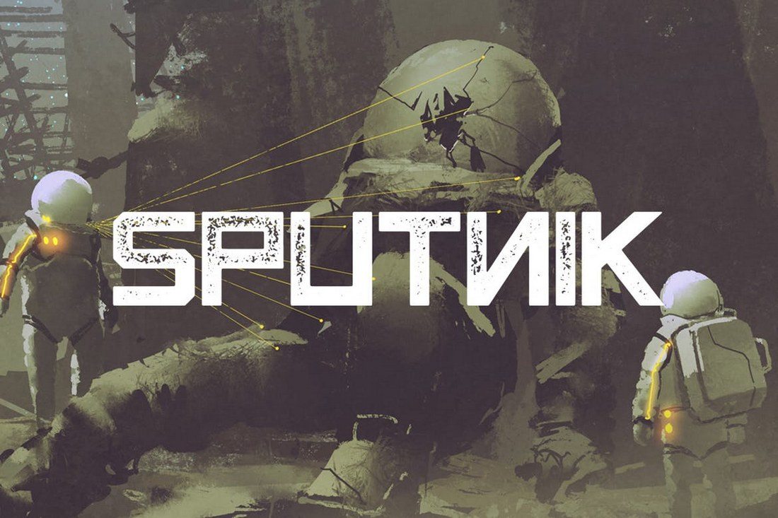
Sputnik Typeface

Sputnik font features a design inspired by vintage propaganda posters. It’s perfect for crafting posters, website headers, social media posts, and much more. The font 4 different styles and, according to the creator of the font, it looks great in Red.

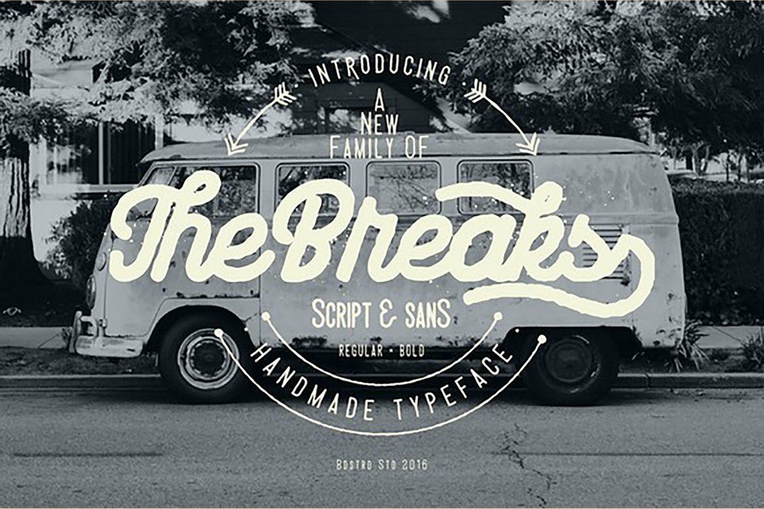
The Breaks

The breaks is a script font with a hand-made design. It can be used to craft many types of designs from badges, signs, monograms, and even posters. The font comes in several different styles, including script, sans, and bold.

Alpha Rough

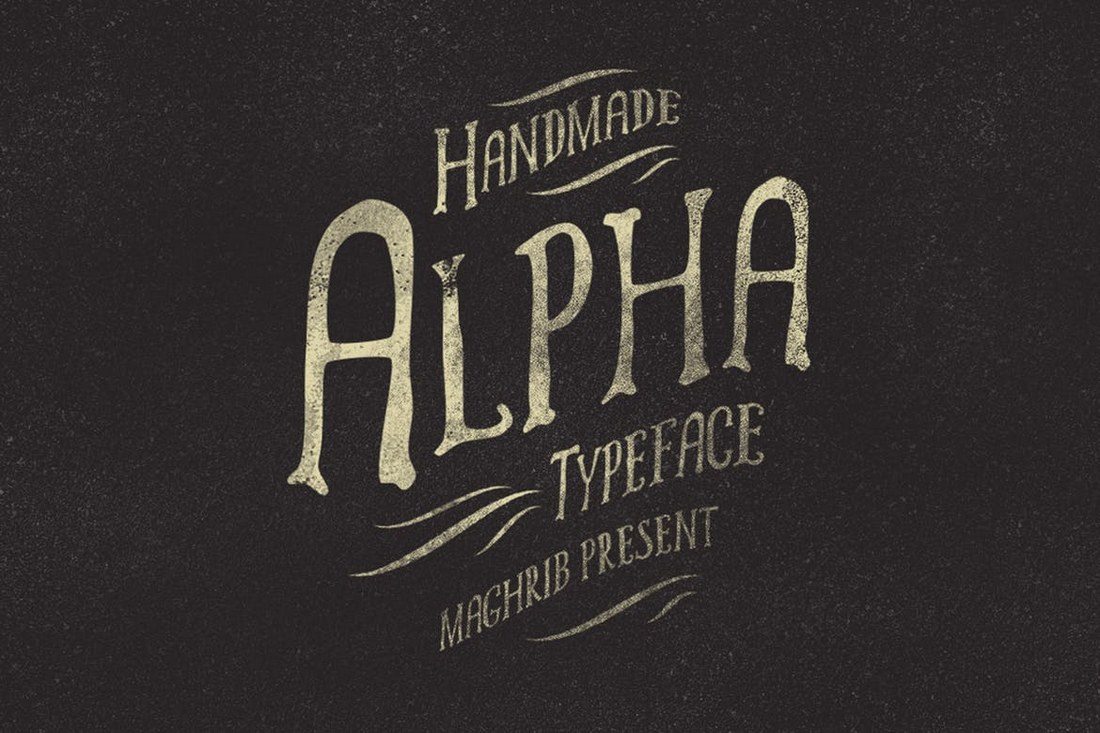
This is a font that features a truly handcrafted look. It features a design inspired by the old Greek philosophy and comes packed with lots of extras, including 42 silhouettes for making your designs look out of this world.

from Design Shack https://designshack.net/articles/inspiration/best-monogram-fonts/

30+ Best Monogram Fonts is courtesy of Instant Web Site Tools.com Blog


source https://www.instant-web-site-tools.com/2019/07/30/30-best-monogram-fonts/

40+ Best Minimal Logo Design Templates

Minimalist logo design is an art. How can you convey your brand with a professional logo, but keep the simplicity of a minimal, clean, and s...