What’s hot in graphic design? One of the things people always want to talk to me about is graphic design trends. Here’s a recap of the top graphic design trends of 2018, plus a little preview of what’s likely on the horizon for 2019.
It’s such an interesting topic because there are trends that change slowly over time – just look at the long evolution of flat design to where we are now – and others that seem to flip overnight. Should you always rush to use the latest graphic design trends in your work? Of course not. But it’s helpful to pick up new ideas, find inspiration, and see what types of techniques and styles are shaping your industry.
1. Bright Color
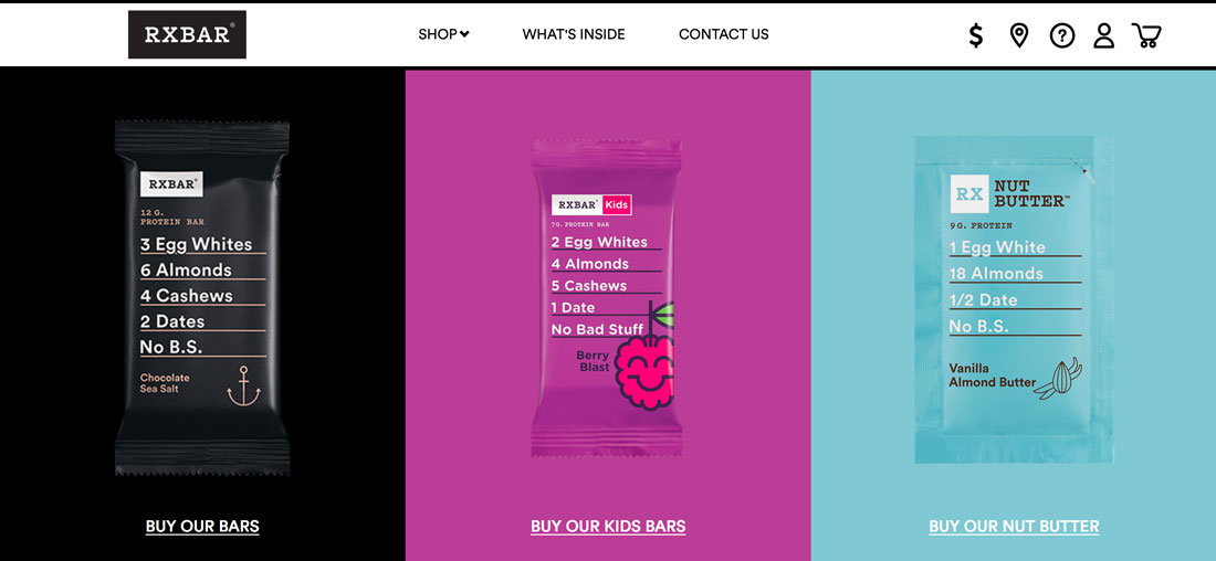
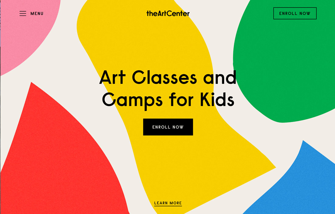
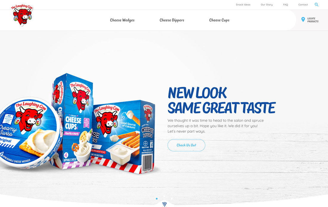
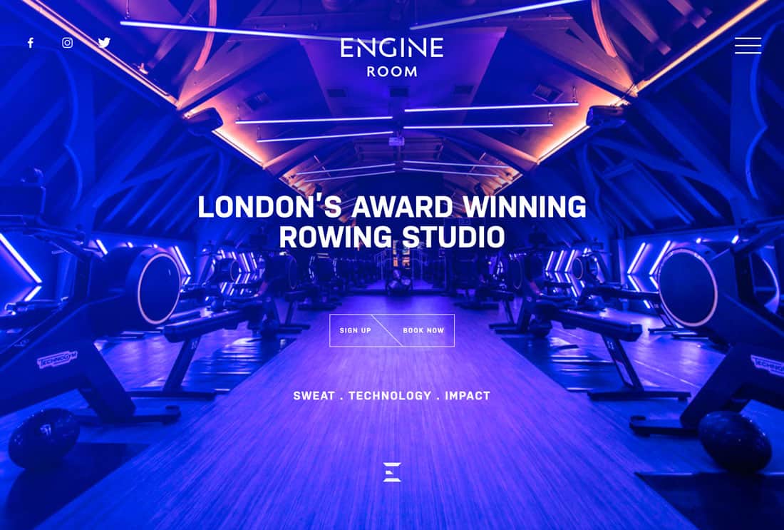
Use of bright color for everything from backgrounds to images to user interface elements was one of the biggest graphic design trends of 2018 for sure.
Projects featuring vivid color palettes have been dominant in website projects and redesigns a well as print promotion and elements. Many of these colors take a cue from Material Design palettes, which are bright and bold featuring colors such as blue, purple and pink.
The two places where color has really shown up is in product and packaging design that carries over to other elements such as website design. RXBar, above, is a prime example of this trend in action. Every color is distinctive and the packaging and website design are perfectly married.
But that’s not the only application of the bright color graphic design trend.
Designers are also using more rainbow-inspired palettes that break the rule of using just two or three colors for the design. Palettes with lots of bright color in interesting shapes or typography have been huge this year.
2. VR and Mixed Reality
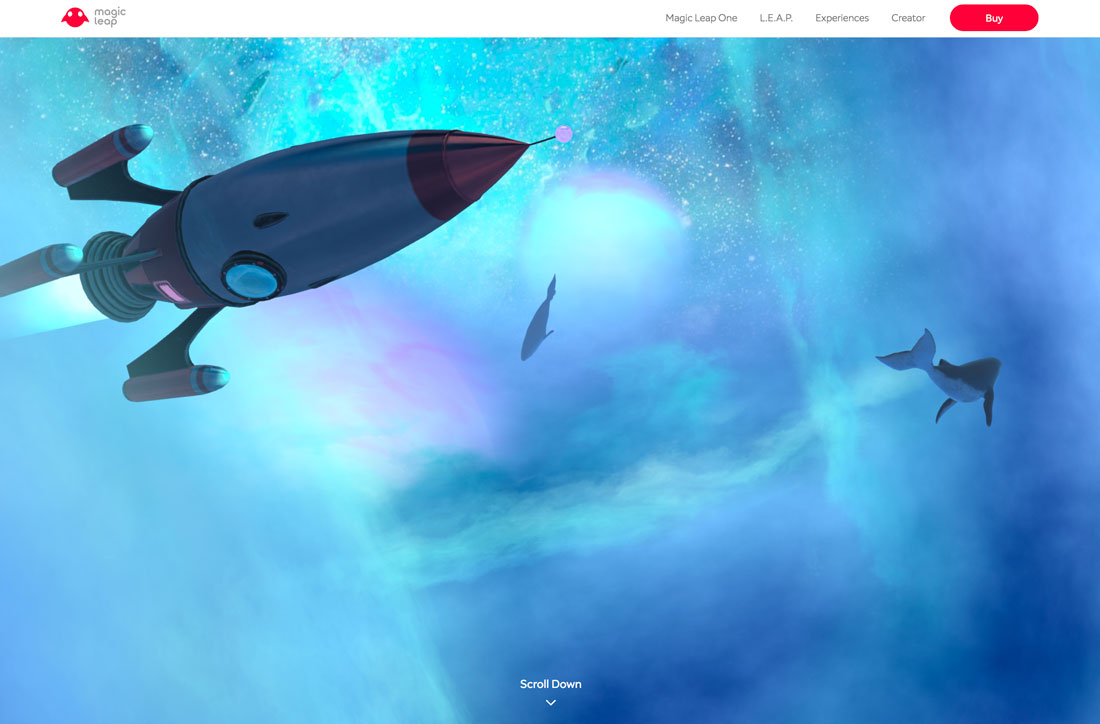
Virtual and mixed reality projects just keep growing as devices become more common.
But there are also projects that use these same design styles without having to use a special device.
This graphic design trend is exemplified by elements that look almost real and move in realistic ways, but aren’t life-like. Think about mixing cartoonish elements and tactile animation.
This type of design is everywhere from websites to short videos and ads. (The technique has been popular in gaming for a while.) There’s even some crossover into print, although there’s an obvious lack of animation.
And while this is a design technique, the trick to really making it work is storytelling. Users have to be a part of the action to truly engage with this type of content. But if you can get their attention, it can be a valuable way to interact with users.
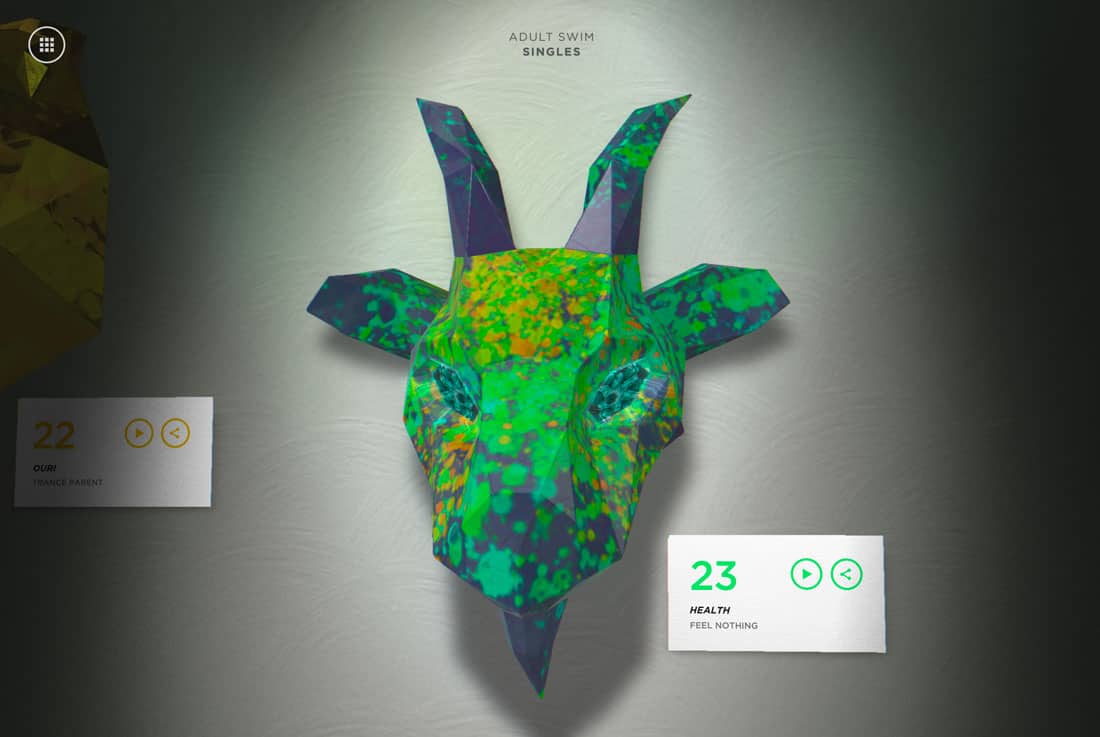
3. Three-Dimensional Still Life Elements
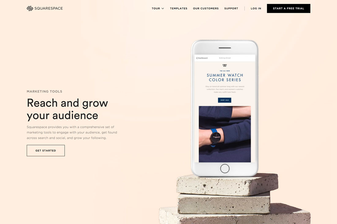
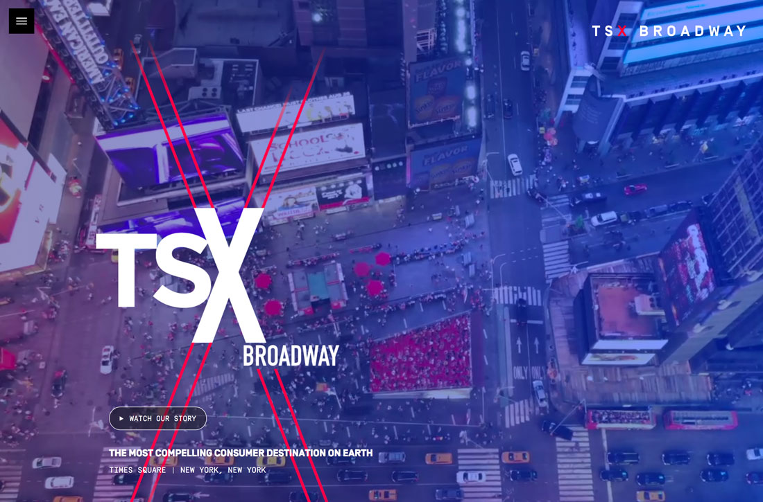
It seems like designers are itching to do three-dimensional design projects. That is showing up in staged elements and still life representations of elements and objects in a 3D space – real or created.
This concept creates a highly engaging canvas and representation for product placements and showing how something might look or feel in real life. These designs are often rather elaborate, although they might not look like it at a glance, and might feature real and created objects.
This graphic design trend shows imagination in action.
4. Single-Page or Long-Scroll Layouts
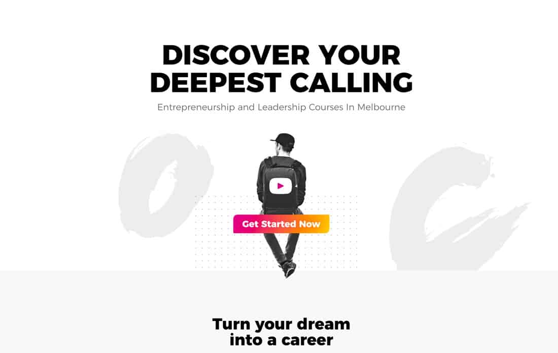
The scroll is not dead! Thanks to mobile internet and usage habits, it’s actually alive and maybe even doing better than ever. (It’s probably not a shock that mobile users scroll … a lot.)
What’s important is designing responsively in a way that’s conducive to this behavior. Using card-style elements, smooth design, and structuring content so that there’s a reason to keep moving down the screen.
What can be complicated about this trend is that what looks like an ideal amount of content on a desktop screen can actually be quite a load on a mobile screen. Single-page layouts need to offer a balance of these use types so that content doesn’t feel sparse or overwhelming.
Generally, this trending design is best for projects that don’t have what would traditionally take a lot of pages or for content that’s broken into smaller chunks for quick digestibility.
5. Gradients
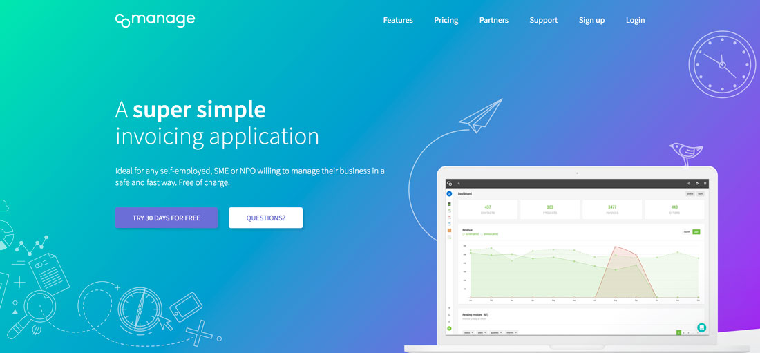
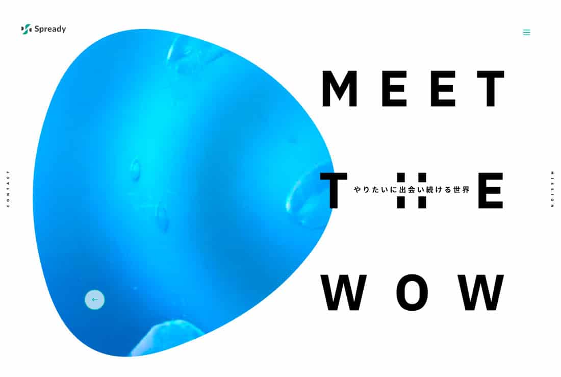
Gradients are everywhere – as backgrounds, as photo and video overlays, inside images, and the list goes on.
Color has been a big deal in 2018 and gradients have been a big part of that movement. The same bright colors that have been popular on their own are also trending choices for gradients.
But not all trending gradients are bold and bright. Some are more subtle with a soft color variation. They can be used with real elements or illustrations and typography.
6. Moving Shapes and Blobs
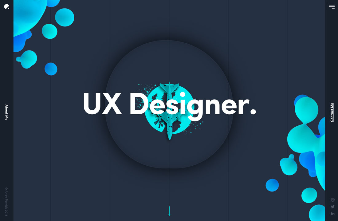
There something majestic about animated shapes and blobs. This design trend centers around “shapeless” shapes that move slowly (or sometimes with a little more pep) in the background of a design.
Blobs can be large or small and often feature bright color or serve as a dominant art or eye tracking element to help users navigate a design.
But this best part is this trend is a little funky and fresh without trying too hard. You can deploy some fun animation without overthinking it and develop a design pattern that’s engaging for users even when the project might lack other imagery such as photos or video.
The biggest users of this trend seem to be startups or smaller-scale projects for that reason. And the innovative designs are worth a look.
7. Minimal Navigation
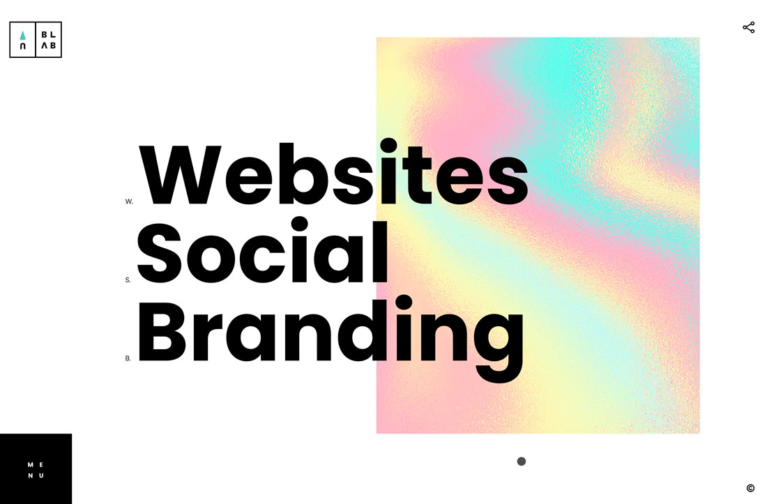
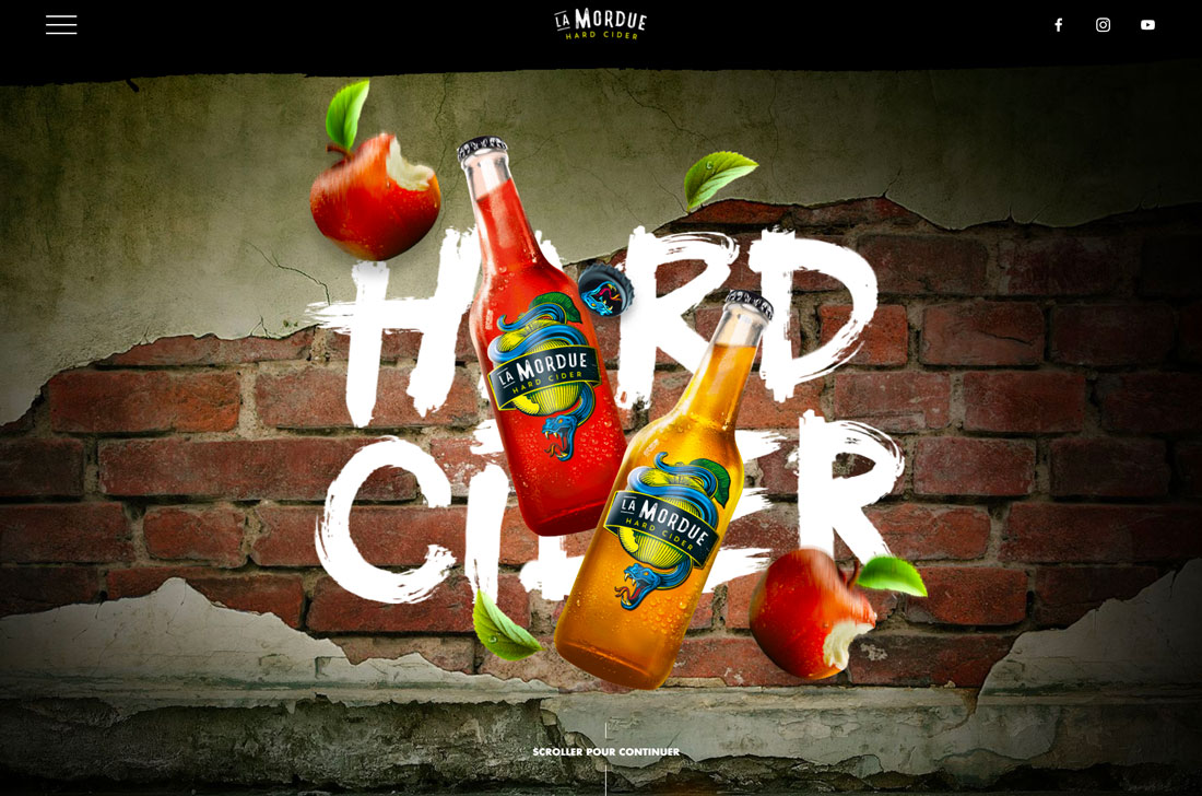
Whereas mega menus were all the rage a few years back, there’s been a shift to more minimal and even hidden navigation elements. This takes a cue from mobile (where most users are viewing websites anyway) to create a more open canvas and streamline user experiences.
While there are pros and cons to “barely there” navigation, the graphic design definitely benefits from a clean canvas and more creative options for tucking away those “pesky” navigation elements.
Both examples above do this in different ways. Blab uses a create square menu button at the bottom left of the screen. Le Mordue doesn’t even show navigation on the home screen, it pops in as users scroll.
8. Authentic Imagery
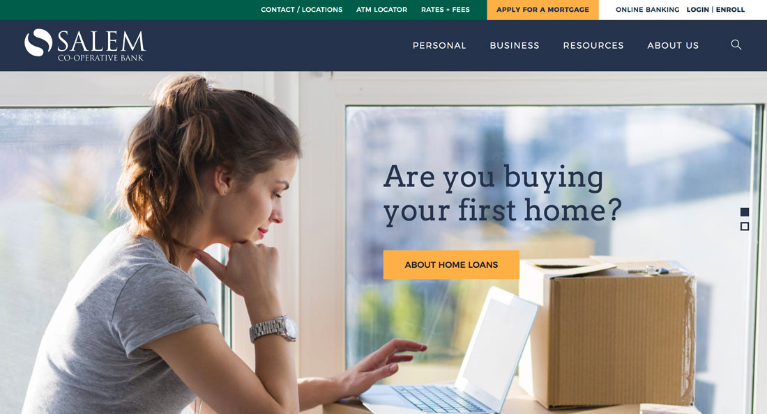
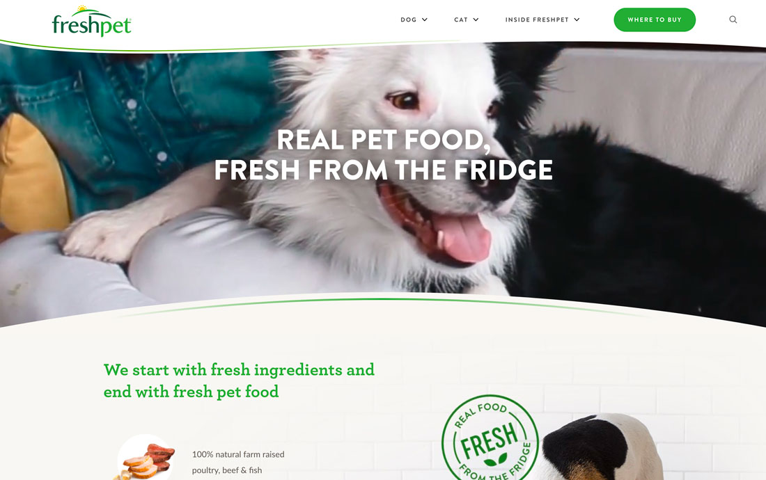
With everyone trying to connect in a true way less polished, authentic images are dominating design projects. Even commercial photography is shifting to look more like snapshots for these projects.
And while the look is a little less polished, it works.
This trend works because it feels more real. It also crosses over to other places where design elements are used for a brand, such as social media.
You can capture this trend using stock imagery – although it can get tricky fast – but the better alternative is to have a conversation with your photographer/videographer about what you want to do visually. More authentic imagery is not amateurish; it’s just a different style.
Higher screen resolutions are making it more important than ever to have high-quality images and—even if the trending style is a little laxer—the quality of the photography should not be.
Conclusion
What new design ideas are you most looking forward to using in graphic design projects this year?
The thing I love about all of these concepts is that they are pretty usable. There’s nothing better than a merging of beautiful design and highly usable experience.
from Design Shack https://designshack.net/articles/trends/graphic-design-trends/
8 Top Graphic Design Trends of 2019 is available on http://www.instant-web-site-tools/
source https://www.instant-web-site-tools.com/2019/02/11/8-top-graphic-design-trends-of-2019/

No comments:
Post a Comment