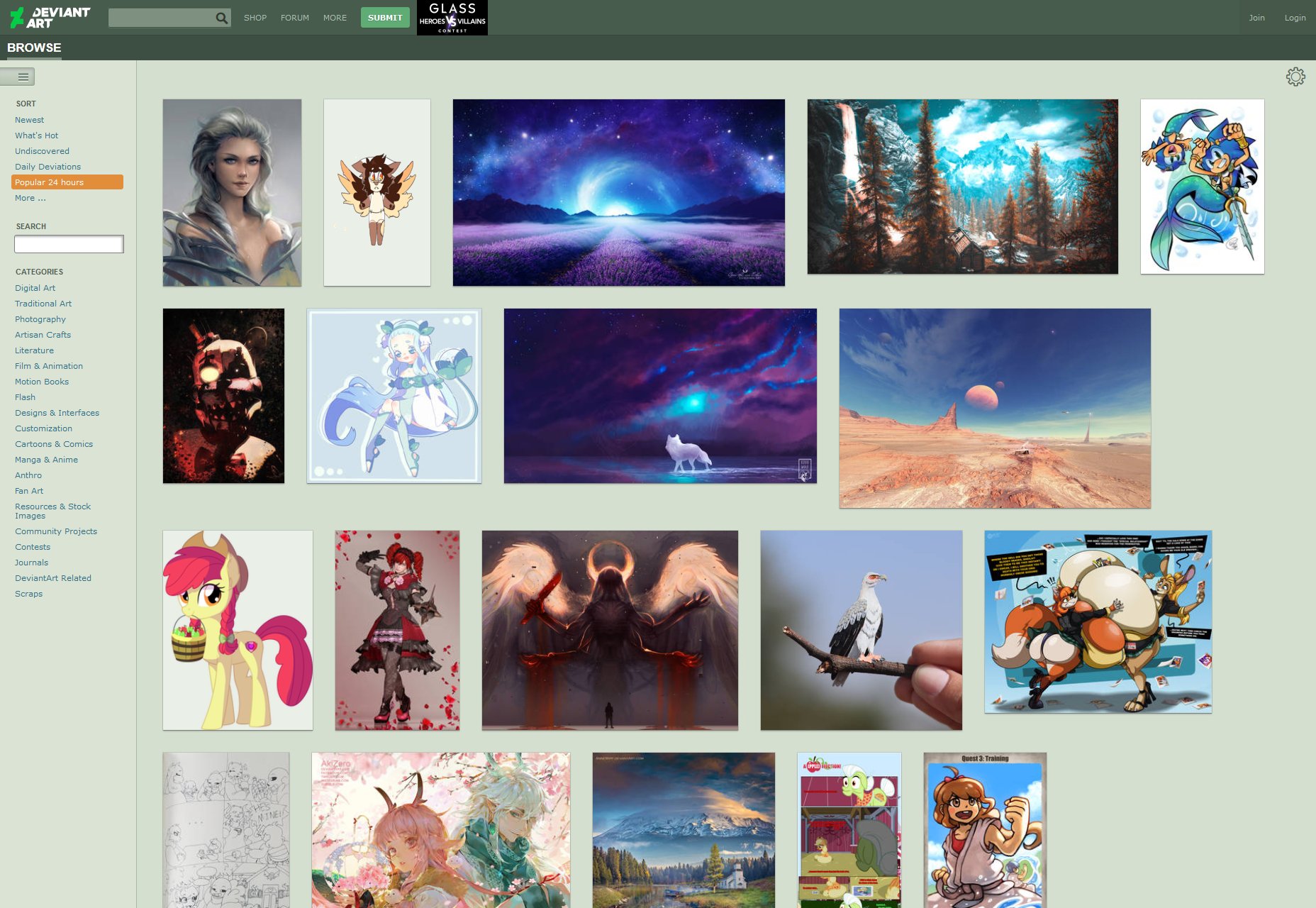
 Wow. DeviantArt; there’s a blast from the past, where I’m concerned. I used to have an account where I posted my amateur web design, photography, and photomanipulation-based art.
I actually remember making art and website mockups on my PC at home, writing the files to a rewritable CD, and taking them to the local Internet café to post them on DA for feedback. It was the site for all artists and designers, at every skill level. And now, it’s getting redesigned.
Finally.
The site has been pretty much the same for years, with updates generally tweaking the design rather than completely redefining it. But Wix bought the site for $36million back in 2017, and it seems they’ve been working on something very different.
The new redesign has been named “Eclipse”, and the opinion of the community is mixed. It’s intended to be dark, sleek, and aimed at professional creators who’d like to sell their work. While that is certainly one subset of the userbase, a very large and vocal portion of the community is made up of amateurs, hobbyists, and fan artists. These users seem to be less happy.
I’ve listed some of the major changes to the site below, and you can find all the changes on the Eclipse Preview Site.
New Aesthetic
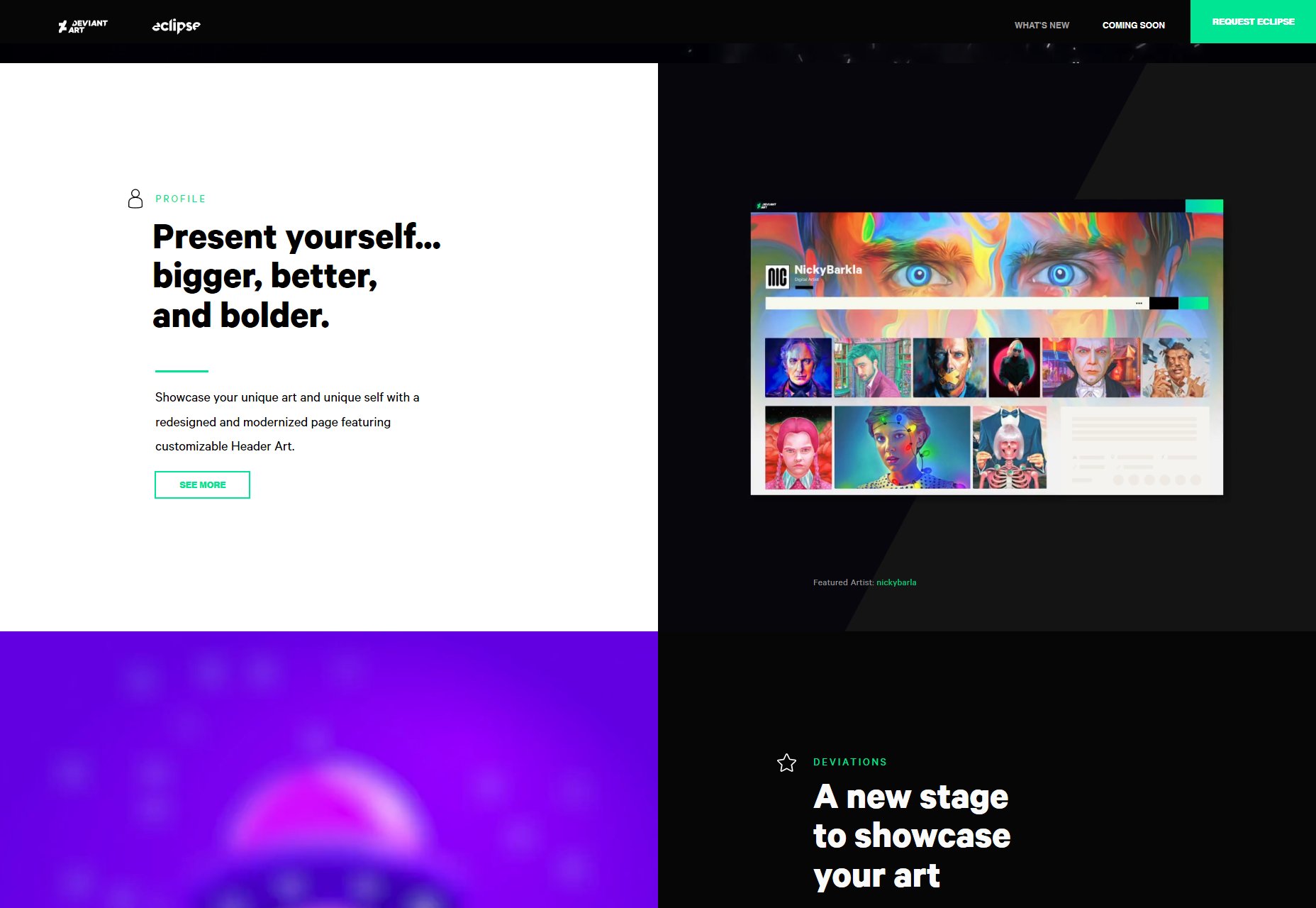
Obviously, there’s the brand new aesthetic for the site. It’s dark, it’s clean, it’s hyper-modern. While it still has hints of green, green will no longer be the dominant color all over the experience.
I personally like it well enough, but it’s the sort of design I like. Objections raised by the community include the fact that the new design seems to be breaking a lot of the old customization options. Another seems to be the apparent similarity to the design of DeviantArt competitor ArtStation.
I’d include more screenshots of the actual UI, but I don’t have access to the redesign yet (it’s still in Beta), and actual detailed screenshots are almost non-existent. It’s a little weird, actually…
No 3rd Party Ads
DeviantArt has decided that with some forty-million users, they don’t need 3rd party ads. They’re going to advertise their own products and services, and run ads for a few “trusted partners” in their own ad program. For a site this big, that’s not a bad idea. It could seriously cut down on malware.
User Profiles
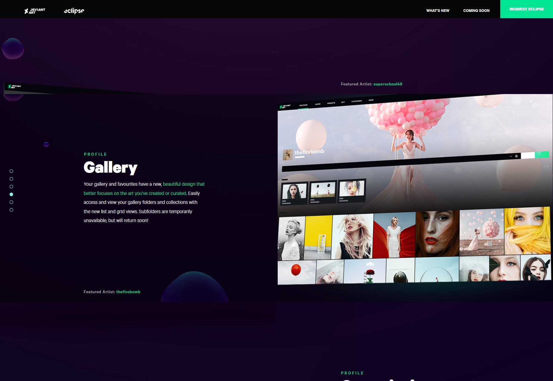
The big changes here are the introduction of header images (because every site has them now), and masonry layouts for the actually galleries. The header image is a nice touch, I guess, but current users don’t seem to think that’s enough, considering all the other custom profile features that are currently broken.
Deviations
Individual art pieces (known as Deviations) will now have the option of using a background image or pattern to present them. It’s a little hard on the bandwidth, I think, but then again you get to present your art piece much like you would in an actual gallery. It’s an interesting concept.
A small but very important change is that photographers can now “tag” the models in their work (if they have accounts on DeviantArt as well). People usually just linked to their profiles in the image description before, so making this bit of professional behavior a bit easier is actually pretty great.
General Browsing Changes
This redesign seems to be bringing in an algorithm to help people find more art they like. Each individual art piece will be judged by the user’s pre-established tastes, and a private “love meter” will be shown to each user based on how well the art aligns with the algorithm’s idea of the user, which I think is perhaps a bit silly.
I already know when I love something.
You can also now browse several post types separately, including commissions, polls, and status updates from your favorite creators.
Journal and Literature Updates
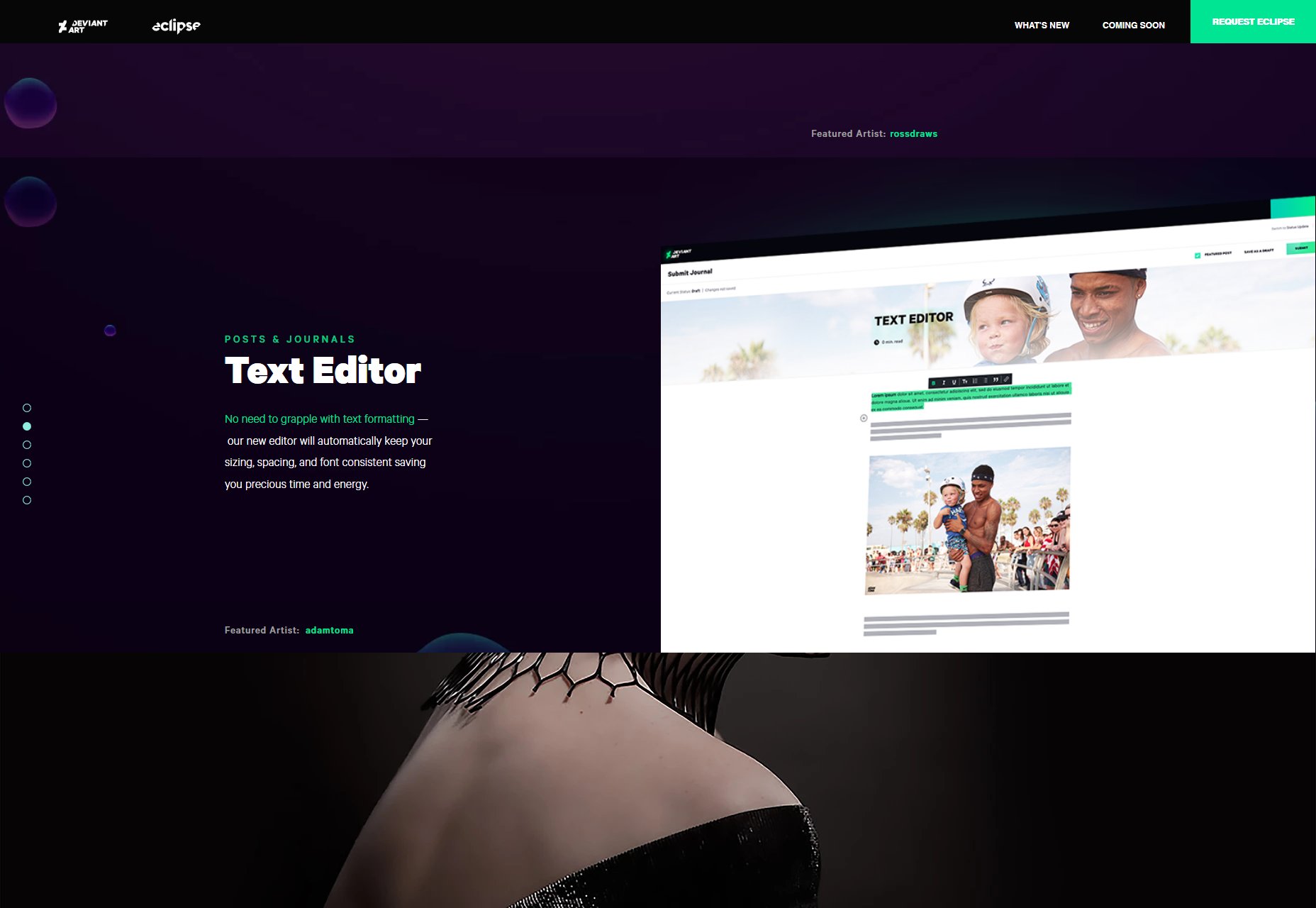
DeviantArt has supported literature as an art form for a while now, and you can post writing to your gallery. There’s also the Journal, which is basically a profile-specific blog available to each user. Interestingly, Eclipse now provides both of these writing features with a Medium-style WYSIWYG editor. As long as they still allow for custom CSS, I’m calling this a positive change.
Premium Digital Content
DeviantArt has allowed people to buy prints and commission art from other artists for a long time, but now, you can also sell digital content online. You can sell stock photos, Photoshop brushes, basically anything you can think of.
My Opinion
DeviantArt is a community-based site, first and foremost. While I generally like the aesthetic of the redesign, the success of it is going to come down to the people who use it (or not) every day. Right now it seems that a significant portion of the community is unhappy with the upcoming changes as they are.
Now, negative feedback can be loud on the Internet, we all know this. But it seems that, at present, I don’t think this redesign does enough to cater to the millions of people who use the platform as a place for self-expression, rather than to build professional careers in art.
But it’s not hit a full release yet, so that may change. I hope it does.
| Add Realistic Chalk and Sketch Lettering Effects with Sketch’it – only $5! |
from Webdesigner Depot https://www.webdesignerdepot.com/2019/04/deviantart-has-a-redesign-in-beta/
The article DeviantArt Has a Redesign in Beta was initially seen on The Instant Web Site Tools Blog
source https://www.instant-web-site-tools.com/2019/04/04/deviantart-has-a-redesign-in-beta/


No comments:
Post a Comment