Of all the retro design styles that have been trending, mid-century modern design might be one of my favorites. The phrase “mid-century modern” is more than just a staple on home improvement television shows, it’s also a classic art and design style that speaks to an era.
The best thing about mid-century modern design is that it can simplify the complex. It was a popular style in homes and décor, as well as graphic and product design in for decades spanning the 1930s, 40s, 50s, and 60s.
Now it is making a comeback as a graphic and web design trend.
What is Mid-Century Modern Design?
“Mid-Century Modern” is a collection of design styles that most us of would consider retro these days. While it’s not always easy to define this aesthetic there are common color, shape, spatial and typography elements that help make it identifiable.
Mid-century modern is often colorful and bold. Shapes and space are often wide, asymmetrical and even aloof in style and structure. Typography is often on the simple side with block sans serifs, simple serifs and plenty of all-caps fonts.
One of the most common features of mid-century modern design is that it looks somewhat abstract and disjointed at a glance, but when you really look at these pieces, they work fantastically. It’s definitely a design style that comes with a distinct manner of taste – people tend to love it or hate it.
The best modern mid-century mod collection of elements might be the visual catalogue by Theo Inglis on Tumblr (also featured above).
Mid-Century Mod Characteristics
There are specific design elements that you can expect to find in most mid-century modern graphic designs.
Part of the reason this “retro” style is trending is that it makes use of other design trends from minimalism to use of geometric shapes. A designer doesn’t have to use all – or even many of – these elements for the style to qualify as having a mid-century modern feel.
Mid-century modern design characteristics often include:
- Use of minimalism or minimal concepts
- Bold or vibrant color with some neutrals
- Use of geometric shapes
- Clean lines and angles
- Textures that resemble wood, leather or glass
- Medium to heavy fonts, often in all caps
- Lack of ornamentation; all elements are usable
- Contrasting design ideas
- Asymmetry
- Rough lines, typography or overall texture
How Designers Are Using It
With distinct ties to art and architecture, mid-century modern graphic design often evokes these ideas. One of the most well-known trending examples of this style is in wall art.
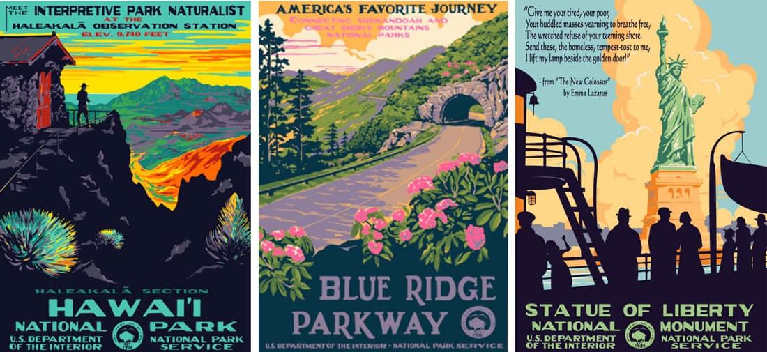
The National Parks Conservation Association and Ranger Doug’s Enterprise has released a growing collection of parks posters in this style (above).
While print elements might be the most common use of mid-century modern design, elements are popping up on web projects as well. It can be a little more difficult to maintain the spirit of the style in this format, but you can definitely see it with more retro-style elements, color options, and type treatments. Use of space and geometry are also identifiers.
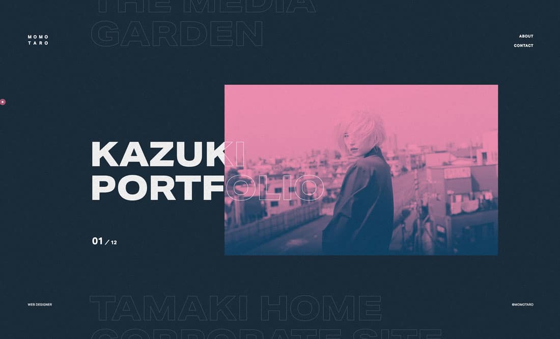
The big difference when it comes to web design is that most of the more muted color palettes of mid-century mod in print are even bolder and brighter, more in line with current web trends, such as Hyper Giant (above).
Tips to Get Started
Mid-century modern styles can be a challenge when it comes to incorporating them into your design projects. You want to balance the retro look and feel with modern techniques so that the design doesn’t look “too dated.”
Each of the examples above uses a “modern” mid-century modern design that’s easy to replicate.
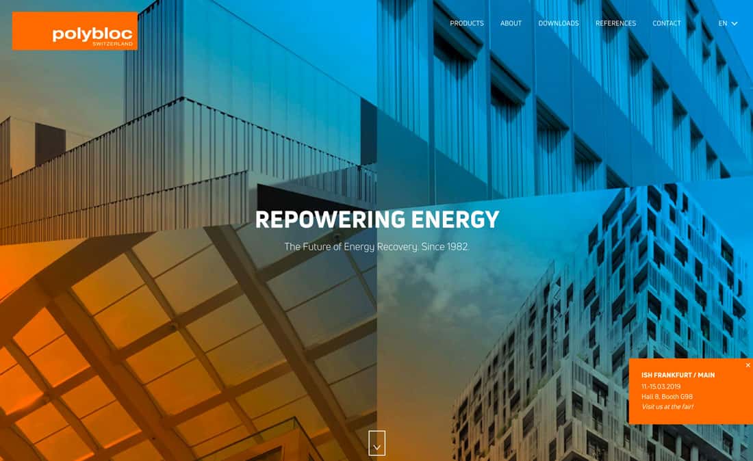
Polybloc uses geometric shapes prominently – both as a background texture in the tight building images – and also in the shapes for each image. This is paired with unusual coloring and minimal language in a simple typographic style. (Note the all-caps.)
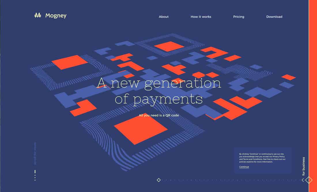
Mogney mixes color and geometry with animation for a fun, minimal style that feels very on trend. The asymmetric design pattern and almost “mismatched” color choices are very mod.
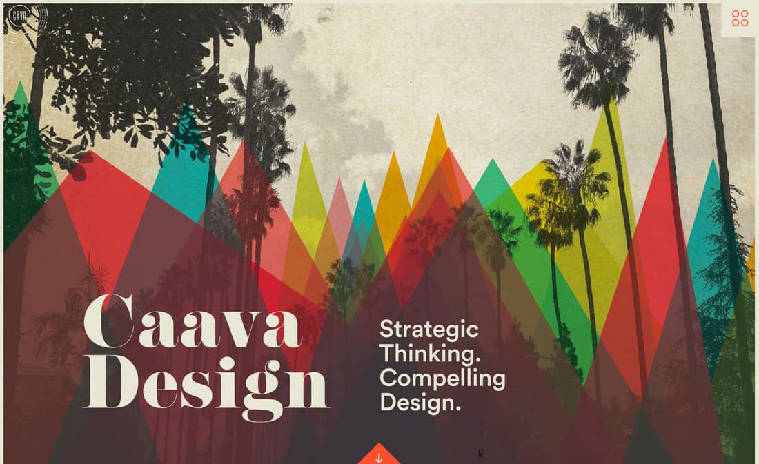
Caava Design might be the closest web representation to the classic stylings of mid-century modern. The color choices and geometry overlay are impressive. These are paired over a neutral base – a common theme in this style – with a typeface that’s a little different from others we’ve seen but with a retro feel.
The trick to using mid-century modern design elements is not to overdo it. Pick the parts of the design trend that appeal to you most and incorporate those into the design. Mix and match with modern techniques and styles to create something that captures the era but also works for today.
“Modern” Mid-Century Modern Elements
Want to get started with a modern, trending design using mid-century modern design elements? We’ve collected five different types of design pieces that can jumpstart your creative thinking or provide a basis for projects.
Portfolio Template
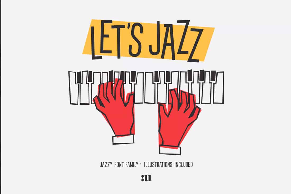
Let’s Jazz Font
Clean Modern Trifold
Teamwork Isometric Concept
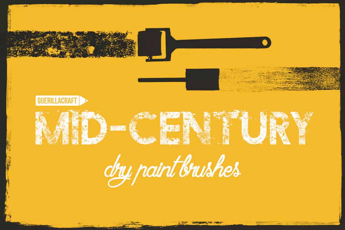
Mid-Century Modern Brushes for Adobe Illustrator
Conclusion
When it comes to modernizing a classic style, such as the mid-century modern design trend, is to use elements of it but not to overdo it. Think about how the design style matches the content of the design.
These pieces have to match for the trend to make sense. Mid-century modern works great for print pieces that have short shelf lives (such as invitations) and web designs that evoke a retro emotion.
from Design Shack https://designshack.net/articles/trends/mid-century-modern-design/
The blog article Mid-Century Modern Design: An Emerging Trend is available on Instant Web Site Tools.com Blog
source https://www.instant-web-site-tools.com/2019/04/10/mid-century-modern-design-an-emerging-trend/






No comments:
Post a Comment