Hand drawn fonts seem to be almost everywhere. But how do you use them in a way that’s different and effective? When it comes to hand-drawn fonts, these tips can help you create something that’s readable and matches the tone of your project.
The hand-drawn font design trend can be somewhat tricky and isn’t necessarily for all projects.
If you do go down this route, make sure you’re approaching it in a way that doesn’t compromise the goals of your design project!
1. Don’t Overdo It

When it comes to hand-drawn fonts, the best thing you can do is not overdo it.
While hand-drawn fonts can be engaging and help draw users into a project, the biggest challenge is often readability. Keeping the design around a hand-drawn style typeface will give users a better opportunity to make out the letters.
When planning for this style, think about the word (or words) you plan to use in the typeface. Is it a common word or phrase that will be easy to understand at a glance, or something a little more complicated? The easier it is to read and understand your word or phrase, the more complex options you have for hand lettering. With unusual or longer words or phrases, stick to more simple styles.
KOTA, above, finds just the right mix with an unusual word and a hand draw lettering style that simple in terms of readability. The simple background and interesting color pattern (an animated gradient) turn the brand name into an art element.
Simplicity is what brings it all together.
2. Think About Meaning
Hand drawn fonts tend to have a lot of meaning baked into the design. Unlike sans serif fonts, which tend to take on the meaning and context of surrounding elements, hand-drawn designs bring plenty of association with them.
From the lean of letters, to the type of brush used, to tails and swashes and embellishments, each typeface can have a distinct association. And it can be hard to shift that meaning, making it vital that the font style match the content of the design to create a project that is meaningful and harmonious.
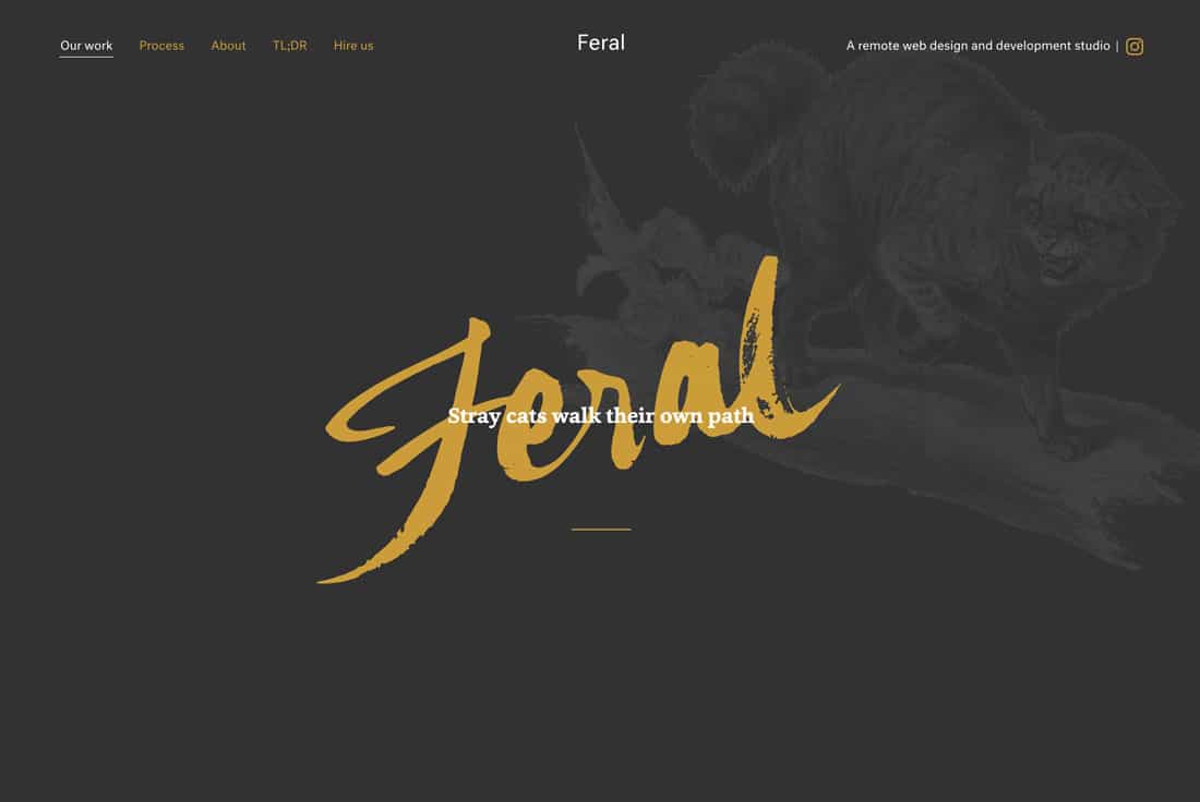
Feral, above, uses a hand-drawn typeface that matches the word itself. The font is a little rough and wild, matching the definition of the associated tray cat. The innate meaning of the letter shapes meshes well with the content in this website design.
3. Think Beyond Scripts
One of the biggest misconceptions about hand-drawn fonts is that they are scripts. There are just as many ways to use hand-drawn typefaces in other styles. All it takes is imagination.
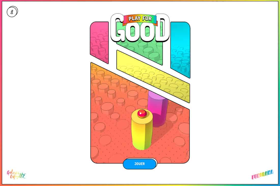
Play for Good, above, uses a fun and light hand-drawn style that’s more of a sans serif/outline font combination. It conveys the right tone for the project with a game show-style feel for the online game.
4. Mix and Match

Mix and match hand-drawn letters with traditional fonts for an interesting combination that’s a little more subtle. This can be a great way to make use of the design trend in projects where an all-out handwriting font isn’t appropriate.
The trick is creating and hand-drawn element that makes sense with the rest of the design. It can take just the right letterform or characters for it to be effective.
Studio Forum, above, does this exceptionally well. The hand-drawn, doodle-style “o” is the featured character in words or phrases that describe the business. It draws the eye to these key selling points while adding just a spark of creativity.
The hand-drawn character is easy to understand and fits with the style of the accompanying font. Note how the size, stroke, and slant all have the same feel to them. The hint of color is also a bonus.
5. Make It Iconic
If you aren’t ready to go all-in with a hand-drawn headline or phrase, try an iconic element.
A fun hand-drawn character or icon can serve as a branding element, drop cap in blocks of text or icon throughout a design. This divot can be a way to use the trend without it being overpowering in the design as a whole.
Using an iconic element in a hand-drawn lettering style is also easy to incorporate into already-complete designs to create a more trendy style. The nice thing about something small in the design is that it can be changed again if trends change without a complete overhaul of your brand or website design.
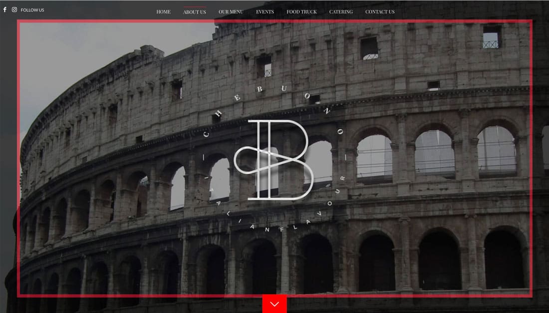
Che Buono uses a large hand-drawn “B” in its design. The cool letterform has a distinct hand-drawn style with clean lines and simple curves. Moving around the website design, you can even see other variations of the hand-drawn letter as it has been refined with the design over time.
6. Ensure It’s Polished
If you plan to use a hand lettering style, it has to be polished. Whether you download a font or create it yourself, don’t get caught with a sloppy or unpolished style.
Lettering should be consistent and include clean lines that don’t pixelate at larger sizes. The font should include a full character set so that you don’t get stuck if you need to add words to your hand lettering elements later on.
The other thing to look for in a polished hand-drawn font is that each letterform has consistent characteristics. The slant of letters, edges, strokes, and shapes should match across the entire font.
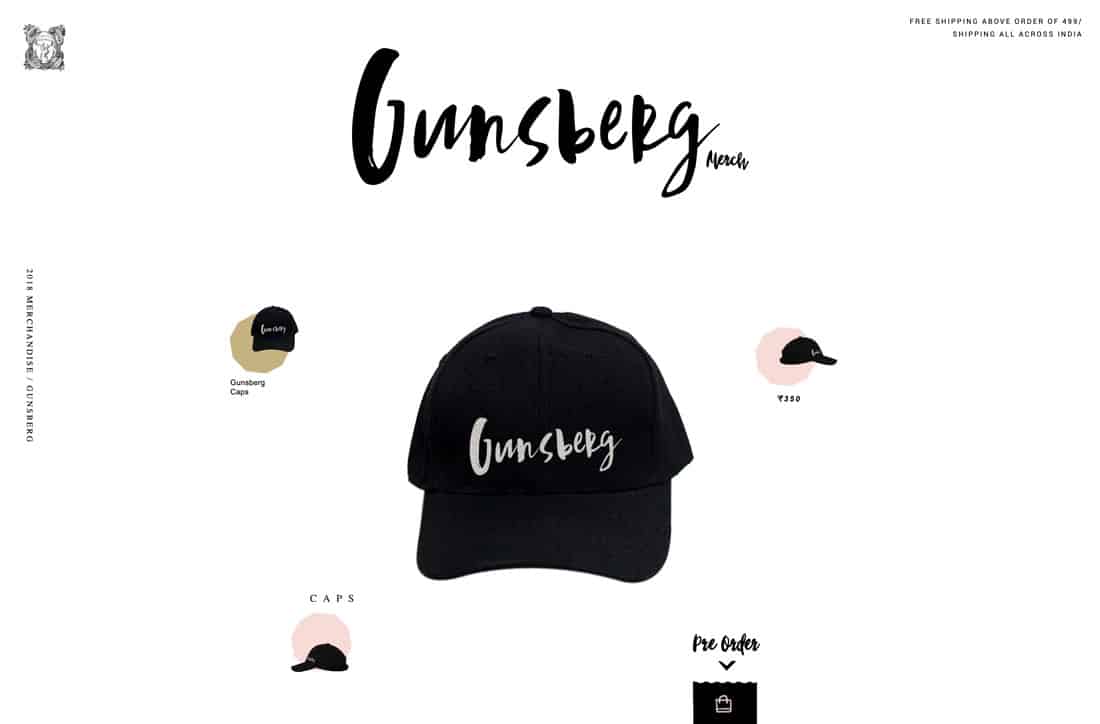
Gunsberg, above, is a great example. The hand-drawn style is clean, and the letters work together rather seamlessly. They look – as they should – like they were created together with purpose. The rougher edges of some letterforms fit together as do thick and thin stroke widths. The character set seems planned and intentional, establishing that polished feel.
Conclusion
The two biggest challenges when it comes to using hand-drawn fonts are that they can be difficult to read and not all of these type styles fit all projects. Hand drawn typefaces tend to have very distinct meanings associated with the style of lettering and it’s important to pick one that fits the project.
In terms of readability, determine if the hand-drawn font is more for aesthetics or information. That can help you figure out how readable a style you need. Fewer letters and words can make a hand-drawn font easier to understand as well.
Good luck using hand-drawn fonts, despite the challenges they can be a lot of fun to design with.
from Design Shack https://designshack.net/articles/typography/hand-drawn-font-tips/
The following post 6 Tips for Working With Hand-Drawn Fonts was initially published on Instant Web Site Tools.com Blog
source https://www.instant-web-site-tools.com/2019/05/08/6-tips-for-working-with-hand-drawn-fonts/


No comments:
Post a Comment