When it comes to excelling with visual appeal, there is no better way than to use illustrations on your website. Of course, it is not something that can be created on the fly. Without a good artist at your disposal, the result could be of subpar quality. It will take your money and precious time. However, it is worth it.
Illustrations always seem to please the online crowd. They roll out unique stories as well as intensify the idea behind the project. They are the first things that get noticed, setting tone for the entire project right away.
And even though we can see various trends and ground-breaking solutions, illustrations always remain one of the favorite tools of web artists. They are like black-and-white coloring in that they always remain classic and classy. With one tiny exception – illustrations let your imagination run wild, encouraging you to bring fantastic ideas to life and use as many colors as you want.
As any versatile tool, predictably we can notice trends and preferences in this sphere. Just recently we have seen small icon-sized illustrations that have taken the web by storm. Today human illustrations try to win over the crowd.
The Complete Toolbox for Web Designers
Unlimited Downloads: 500,000+ Web Templates, Themes, Plugins & Design Assets
TMS / Marie Sahy
TMS welcomes online visitors with a full-screen illustration that demonstrates the agency’s sphere of expertise in a fancy way. It supports the big tagline on the left, making it more prominent. Note, the phrase “We build great apps” may be a bit confusing for non-techy people, but the illustration tries to smooth things over.

With her bizarre, bold and daring illustration Marie Sahy managed to make a statement. The illustration conveys the free spirit and creative soul hidden inside the artist in the twinkling of an eye. It feels extravagant and at the same time personal. This is an exciting combination.
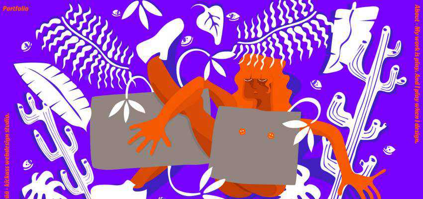
The use of human illustrations is a trend these days. And it is not just another way to add to aesthetics or please the eye of online visitors – it has a deeper meaning.
There was a time when web designers used videos and images to support the idea behind a project. Now, the artworks carry out this mission – bridging the gap between non-tech-savvy people and artificial web applications.
BAW Agency / Buster Fetcher
The team behind BAW Agency employs illustration to reveal the meaning of their tagline. You can see busy people that are occupied with their tasks and the application that helps them to sort things out. The artwork feels a bit techy, yet with a certain dose of human warmth.

The team behind Buster Fetcher has gone even further. Here you will find not just an illustration, but an entire cartoon that explains to onlookers how the service works. In such a unique way, the team makes complicated things simple. And hand-drawn people assist them in this matter.

Junto Agency
The creative team of Junto Agency prefers a small animation. Their hero illustration is partially set in motion to make the action of the people more evident. It is reminiscent of all those fancy cinemograph pieces that were so popular five years ago. It works effectively as an introduction.

Lemonade
The team behind Lemonade uses not just one, but several illustrations. Each one features people that do various tasks. And each one is aimed to explain concepts related to the web sphere such as design, development, and maintenance.

Netwise
Much like the previous example, Netwise has a lovely illustration where people are engaged in a daily routine. They analyze, improve and design the best business solution for you. You can see a bunch of people who work on your project. This can not help but inspire trust.

Ecrease
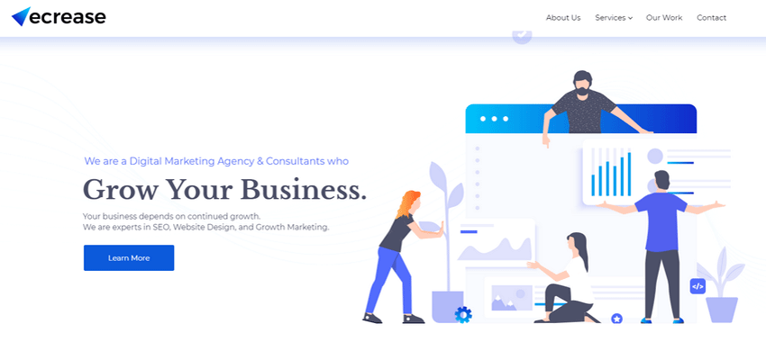
Ecrease has fewer people in the picture in comparison to the previous example. Nevertheless, it is still enough to establish credibility with the public. It is also set in motion to instill some life into the cartoon characters. What’s more, it is not the only illustration here; there are others that also display people at work. The website feels closer to regular users, that’s for sure.
Nam Insik / Closer Game
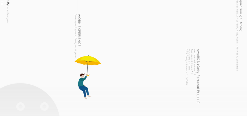
The personal portfolio of Nam Insik and Closer Game are fully-illustrated websites. The first one is a vivid representative of projects that we have seen a million times. It is a personal portfolio where the tiny human mascot plays the role of a leading actor. He guides the online audience through the story of an artist.
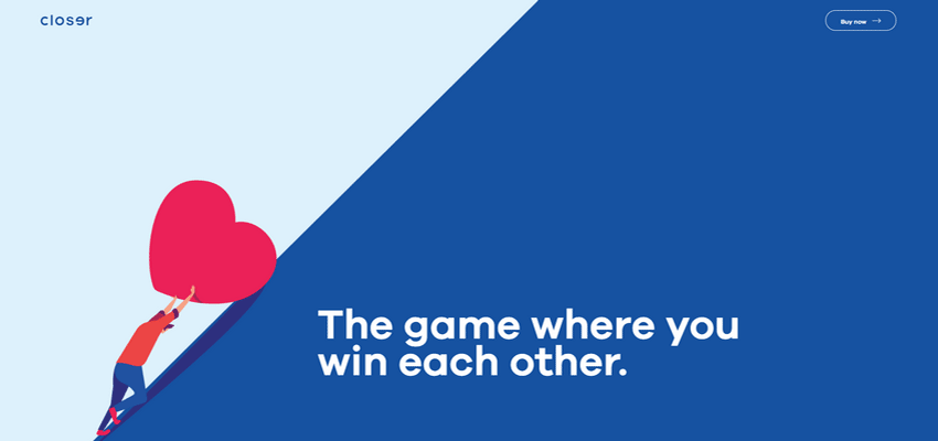
The latter is a new kid in the block. The website promotes a game. It is teeming with illustrations where humans are involved in making the essence of the game clear to potential buyers. Both projects feel personal and have a powerful dose of charisma.
Rivne Holod
With its vibrant and creative design, Rivne Holod proves that human illustrations can come in handy in various spheres. The company is the leading supplier of quickly frozen forest berries in Ukraine. Here, the artworks that accompany almost every section help to show the nature of the product, the traditional approach, and authenticity of the company. Simple and smart.

Sehat Kahani – The Story of Health
The team behind Sehat Kahani – The Story of Health has taken it seriously. The website is populated with excellent human illustrations where a woman performs the primary role. Each section has its hero artwork that serves as a preamble. Even though these people are faceless, they still feel familiar – almost like our neighbors. The website is not “cold” and techy – that is exactly what the doctor ordered for a healthcare website.

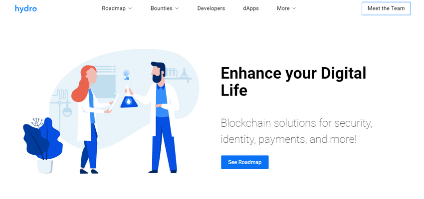
Hydro
Much like the previous example, Hydro has lots of illustrations. The blockchain is a sphere that lacks human contact, even though without people it won’t survive. So it is not surprising that the team has included an illustration that features human beings. They feel entirely appropriate for the website, giving sense to intricate concepts and enlightening the essence of the business.
A Touch of Humanity
Illustrations always give a website some warmth. And when it comes to human illustrations, they produce an even better impact. They feel personal, individual and charismatic.
The artistic touch, in tandem with the personality hidden inside drawings, soothe the “cold”, faceless interface where digits and text run the show.
Even though they play a secondary role in supporting messages or explaining concepts, in terms of enhancing the user experience and making the website look personal, they undoubtedly occupy the leading position.
The post Adding Warmth and Personality to Websites with Human Illustrations appeared first on Speckyboy Design Magazine.
from Speckyboy Design Magazine https://speckyboy.com/human-illustrations/
The following blog article Adding Warmth and Personality to Websites with Human Illustrations Find more on: Instant Web Site Tools
source https://www.instant-web-site-tools.com/2019/06/23/adding-warmth-and-personality-to-websites-with-human-illustrations/

No comments:
Post a Comment