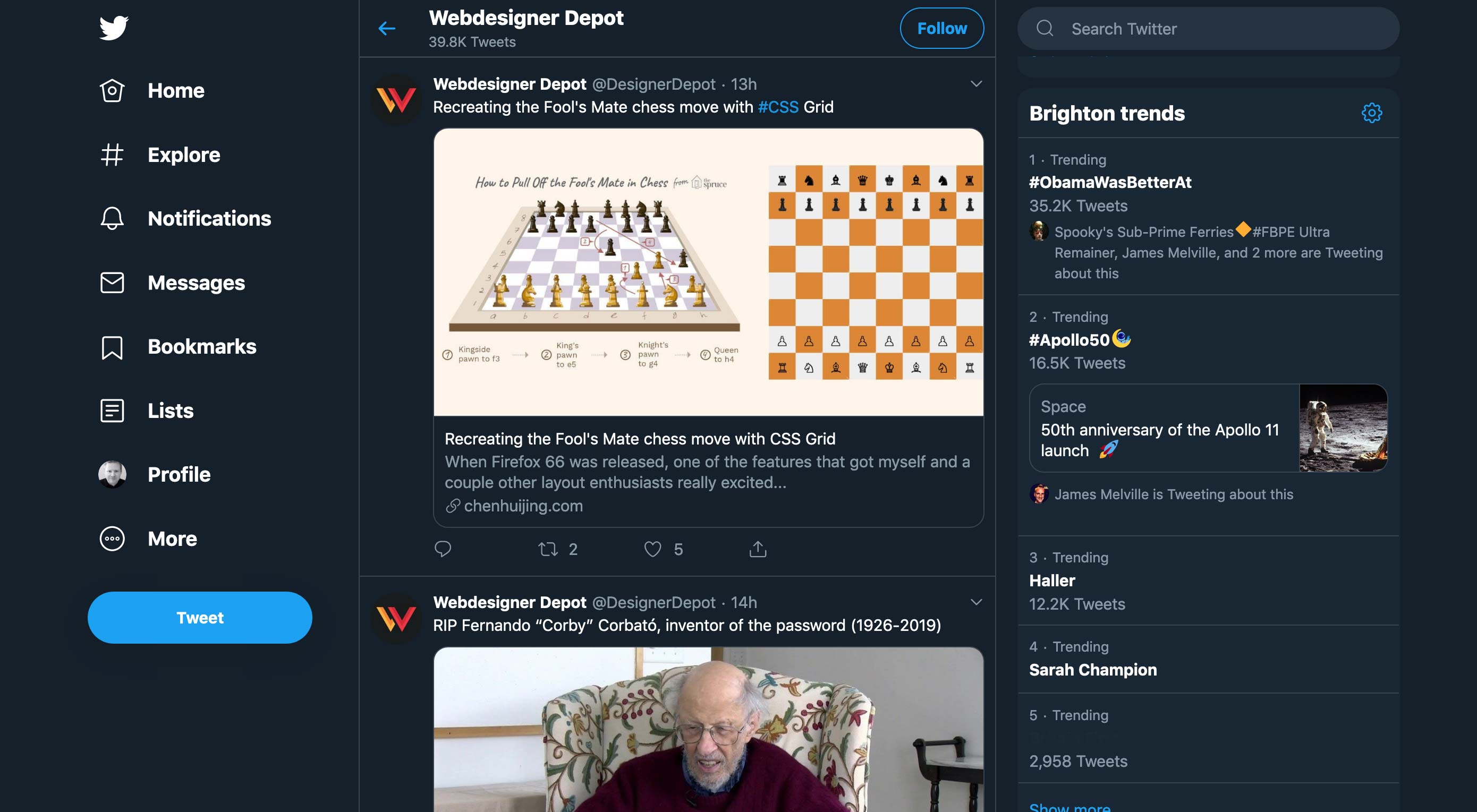
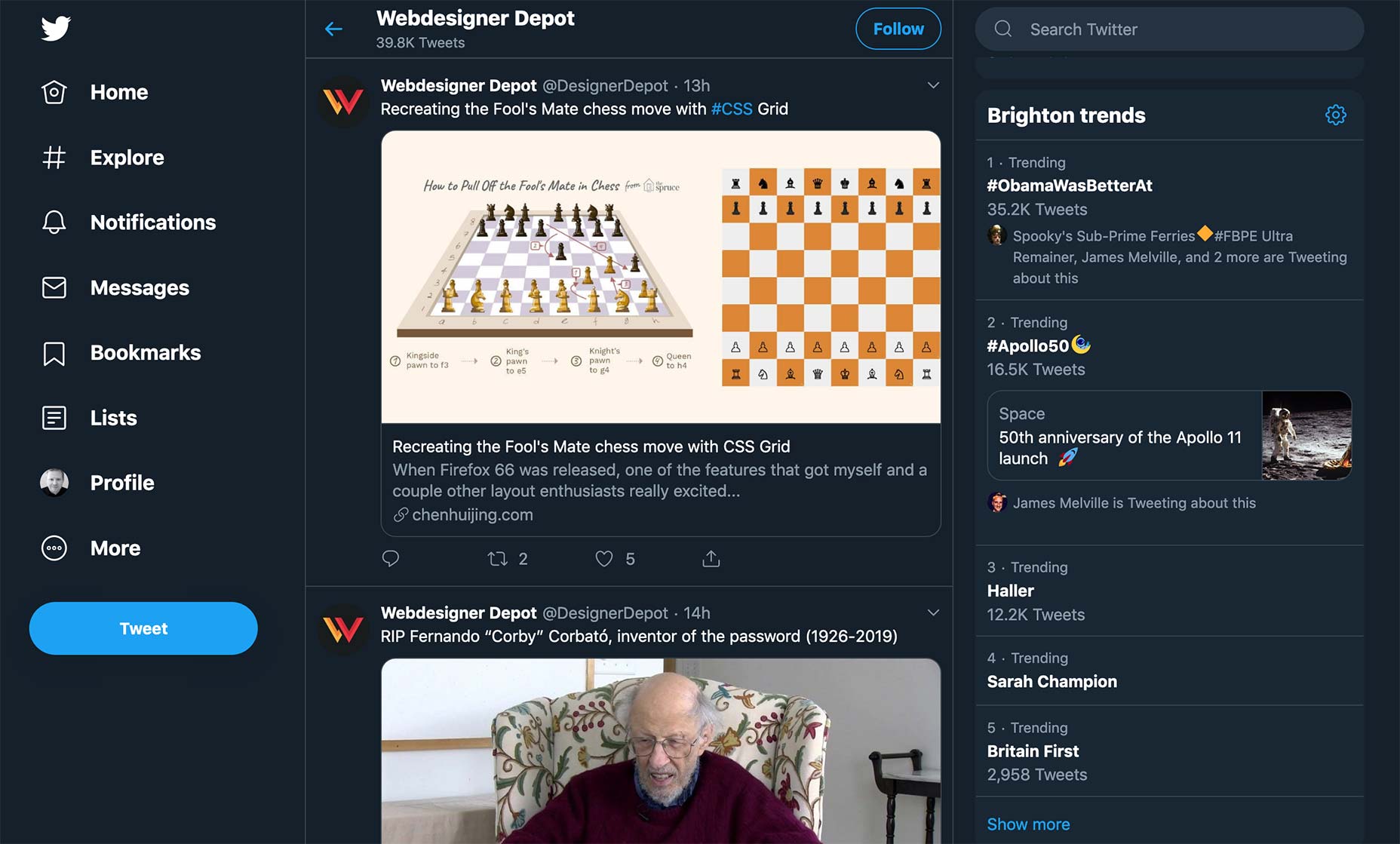
 After months of extensive testing, the new design is a confident, and positive change for one of the web’s biggest names, albeit with some controversy that is bound to cause a ruckus. If you’d like to be among the first to have an opinion, you can opt-in right now, or Twitter will opt-in for you in the coming days, because this change is mandatory.
the new Twitter site is self-consciously dashboard-like
Twitter’s life began as a deliberately stripped down social network, in the same way that Google began as a stripped down search interface. Throughout its history, design changes seem to have been attempts to add features, without changing the core simplicity of its timeline UI.
The new Twitter design throws that strategy out of the window, with fundamental changes to the site. Where once there was the illusion of a simple news feed, the new Twitter site is self-consciously dashboard-like. Helped, in no small part, by the relocation of the menu from top horizontal, to left vertical.
The navigation change has been an opportunity – or more probably, a solution – to expose some of the features that have been introduced, but are rarely used outside of the mobile apps; the explore tab, bookmarks, and lists are all prioritized, and direct messages now have a dedicated space.
You’ll also find the introduction of not one, but two dark modes, which is presumably intended to increase eye-fatigue, ensuring you spend less time on the site ranting about the lack of an edit button.
there’s very little new here, other than a more app-like experience for users who prefer not to use an app
There is, frustratingly, still no edit button. Anyone who spends any time on Twitter will be aware that 50%+ of all tweets are instant replies, by the same account, correcting a typo in its original tweet. Of course people can’t be allowed to edit a tweet that’s already been liked or retweeted, but there’s no reason Twitter couldn’t strip likes and retweets from any edit.
Perhaps more frustrating is the fact that verification is still limited. Pop-stars, movie-stars, politicians, et al get a little blue badge, but you and I don’t. What this means is the platform is still essentially anonymous, and will continue to be plagued by bots, trolls, and spam. If Twitter is looking for a way to monetize its main product, paid verification with the option to auto-mute anyone not verified, would make Twitter more usable, more profitable, and just plain nicer overnight.
This design feels like a long-overdue update, delivering necessary breathing room to allow the introduction of as yet unseen features. However, there’s very little new here, other than a more app-like experience for users who prefer not to use an app.
Some might suggest that a company is entitled to update its site design any time it likes, but those people must not have witnessed the meltdown some users had the last time Twitter introduced a far less substantial tweak to its UI than this. Others might question whether anyone actually uses Twitter on desktop; isn’t that what cellphones and bathroom breaks were invented for?
from Webdesigner Depot https://www.webdesignerdepot.com/2019/07/meeting-the-new-twitter-com/
The following blog article Meeting the New Twitter.Com is available on The Instant Web Site Tools Blog
source https://www.instant-web-site-tools.com/2019/07/16/meeting-the-new-twitter-com/


No comments:
Post a Comment